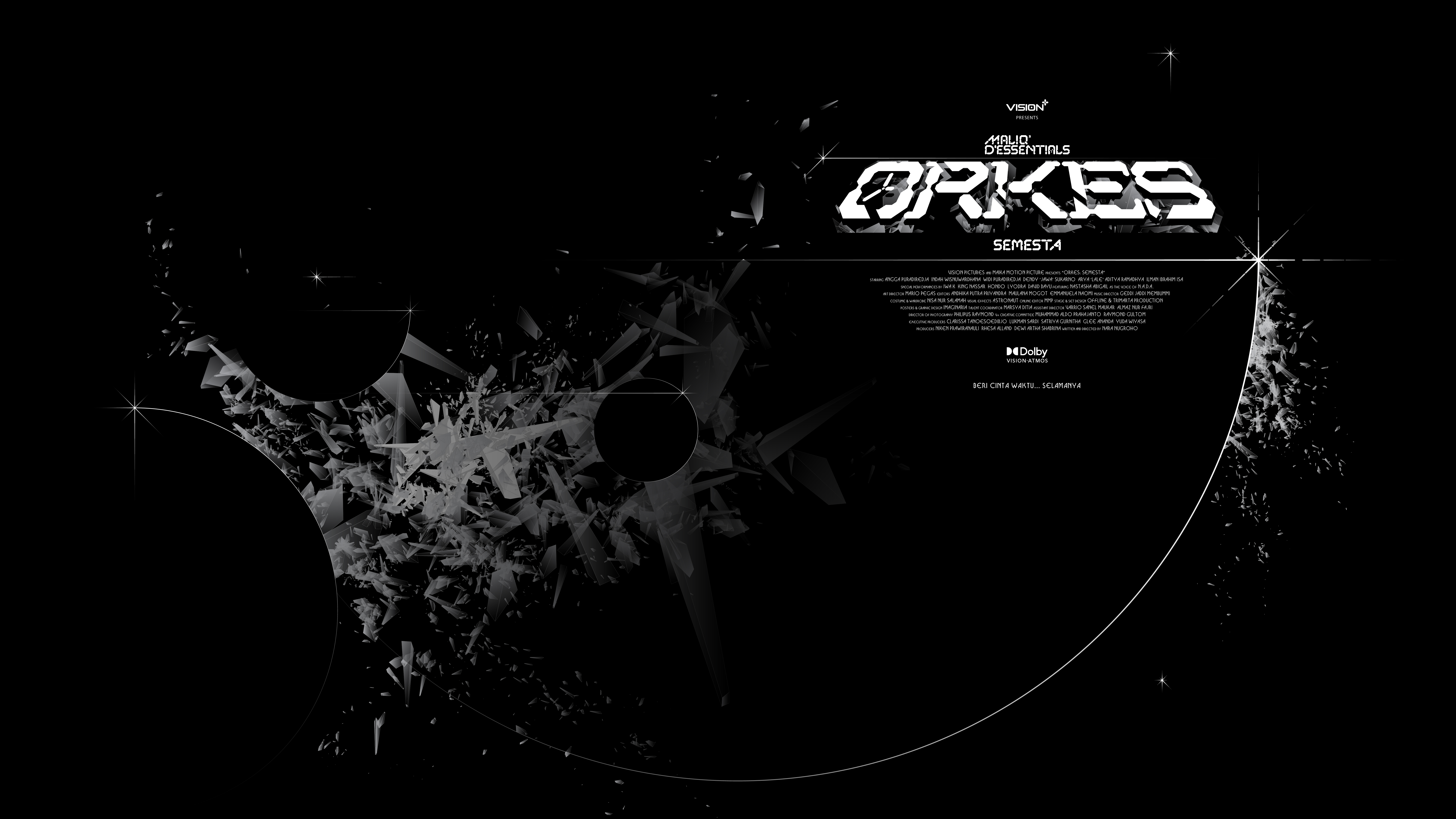
EARLY KEY ART
ORKES SEMESTA
Type of Work
Art Direction, Branding & Identity, Film, Motion
Type of Client
Entertainment & Music
Art Direction, Branding & Identity, Film, Motion
Type of Client
Entertainment & Music
Role
Art Director (Film) & Lead Designer (Marketing)
Team – Collaborators
* MMP - Maika Collective Studio (Production House)
Art Director (Film) & Lead Designer (Marketing)
Team – Collaborators
* MMP - Maika Collective Studio (Production House)
Project Status
Completed
Project Length - Year
6 Months - 2022
Completed
Project Length - Year
6 Months - 2022
Orkes Semesta is a semi-documentary film project of Vision+ Pictures in collaboration with Maika Motion Picture focusing on archiving Indonesian culture & music through infamous icons, musicians & artists. The retrospective is told by blending elements of science-fiction, live music & archival documentary filmmaking.
The first episode stars Maliq & D’Essentials as the first of many Indonesian musicians/artists to be featured in this series; this series is an answer to the prevalent issue in Indonesian music: the lack of cultural archiving medium & platform. In this project my role was the Art Director for the Film & Lead Designer for Marketing; I was heavily involved in the production: conception of the story, visual direction & the design of Orkes’ film branding & world-building. The project is captured through recognizable branding & visual identity, type design, illustrations, animations & visual effects
The in-depth look towards the making of the film can be seen here.
Watch Orkes Semesta in Vision+
The story of Orkes was inspired by the cultural preservation through real-life technological endeavor; in The 1977 Voyager Golden Record — we found the most fitting & only narrative frame by equating ORKES as a time capsule. The Golden Record was a pair of phonograph records included aboard the two Voyager spacecraft; portraying human ingenuity, our longing to be heard, and our desire to be remembered.
The time capsule is a literal & figurative manifestation of the ORKES concept; it aims to archive of Indonesian music culture in a manner that evokes a purpose based on hope & romantic feeling towards the future. A way to look forward without forgetting the past, a future nostalgia.

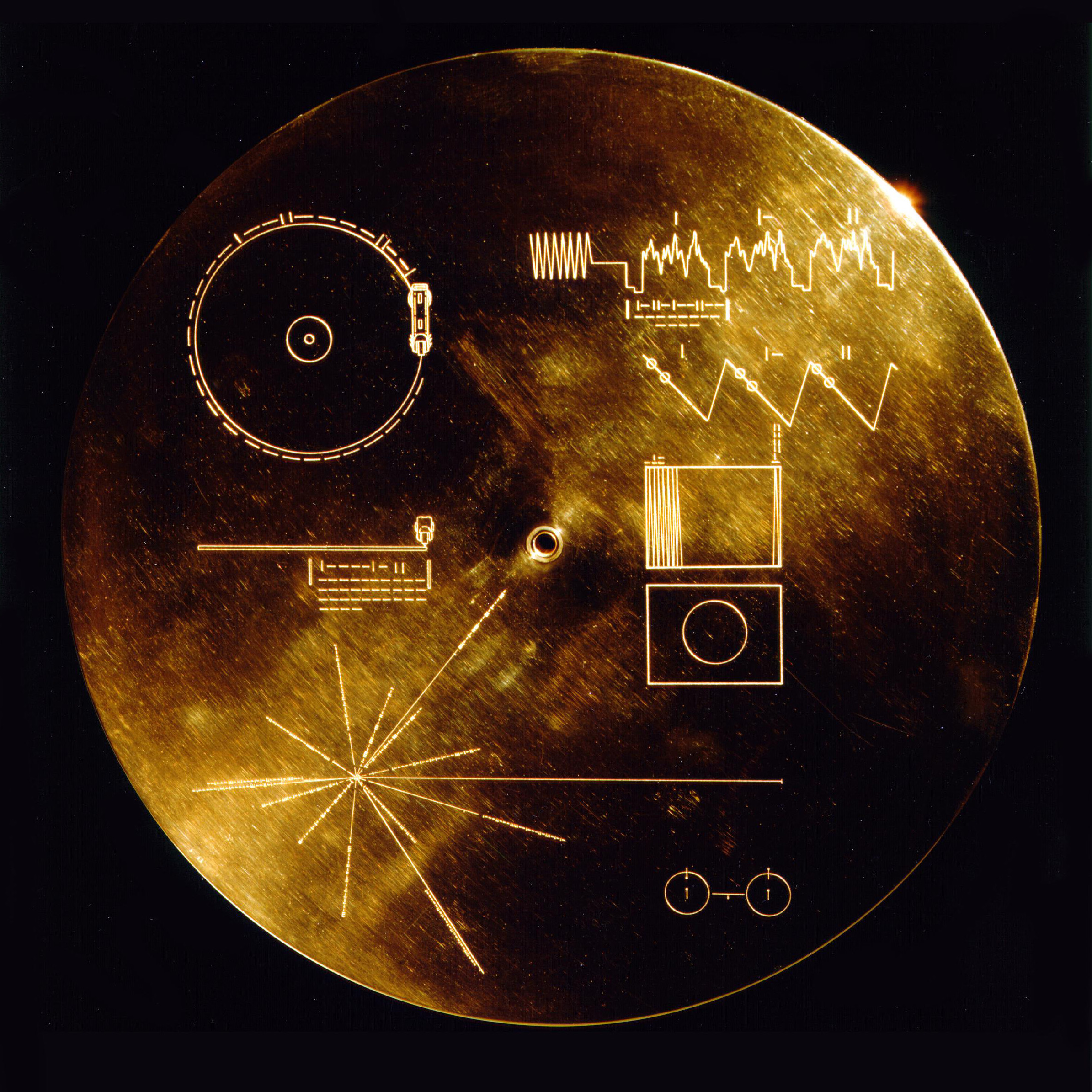
VOYAGER GOLDEN RECORD, CIRCA. 1977 IMAGE CREDIT: NASA/JPL-CALTECH
IP SYNOPSIS
In 2120 AD, an Indonesian private intergalactic entity was established — dedicated in the preserving humanity’s most important cultural artefacts, the name ORKES is coined two years after the conception of the organization. With the hopes of sustaining the most important parts of our humanity in the form of culture; music so that our souls & spirits may live on beyond our predicament.
And so they gathered the best musicians across the globe and archived their performances inside Orkes; the musical capsules, the time capsules; our medium to bring warmth and humanity into the cold and vast vacuum of space. The closest capsule is Semesta. It is kept at a geostationary orbit some 35,000 kilometres above Earth's surface.
BRANDING: THE MARK OF TIME
One of the biggest challenges in appraching the branding is how we redefined the archaic feeling & meaning into something futuristic & advanced; therefore a drastic & bold aesthetic choice is the approach we went for to emulate this redefintion.
The form of the logo itself is based of the visuals of early ‘digital’ interfaces found in in digital clocks, and other apparatuses. The idea is to create a vintage, yet pop, futuristic look. The Mark of Time comprised of a container & contents, the container being the capsule & the contents being time. Portraying a preserved time, a stillness of time — a simpler, much more concise & effective portrayal of a time capsule in the form of a visual identity.
The design of the type uses the same octagon base form, creating a digital aesthetic that feels futuristic. For the type we opted a more wide, extended design to represent & capture the cinematic landscape, scope & scale of ORKES.

THE LOGOGRAM OF ORKES
‘THE MARK OF TIME’
![]()
THE LOGOTYPE OF ORKES
‘THE IDENTITY OF TIME’
The typefaces designed were based off the same modules & structural integrity of the Logotype; the official display typeface was created to further strengthen the brand narrative of the Orkes as an entity (OTT & IP).
![]()
![]()
![]()
![]()
![]()
![]()
![]()
![]()
![]()
![]()
![]()
![]()
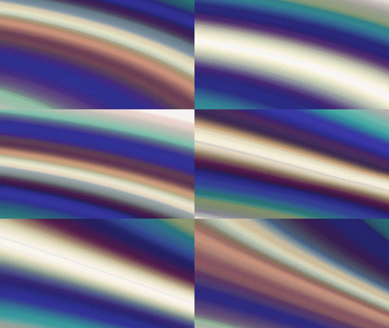
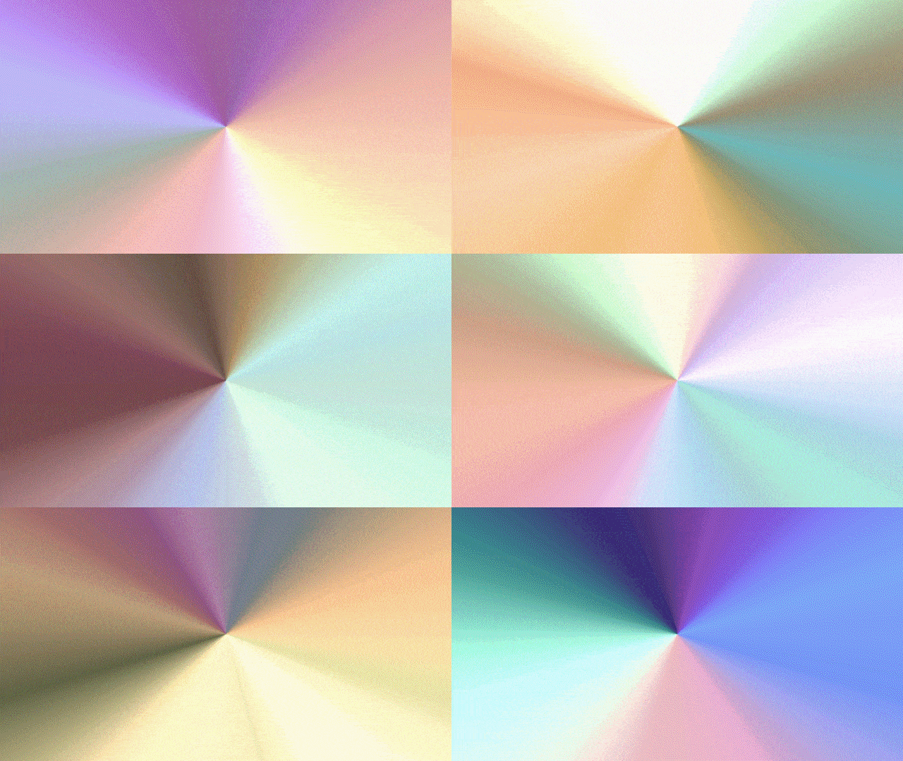
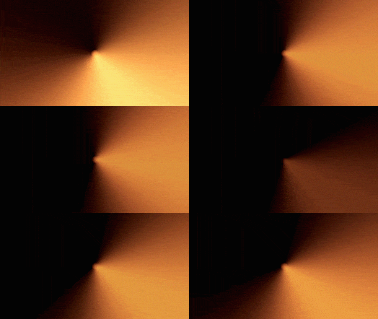
The supergraphics were created using TouchDesigner through programming and code, the idea was to simulate iridescence to portray the feeling, sensation & euphoria unique to each individual. The visuals were designed according to Phases; which gradually changes from the more dim to bright & vibrant; mostly to portray the experience of live music stage shows.
‘THE MARK OF TIME’

THE LOGOTYPE OF ORKES
‘THE IDENTITY OF TIME’
TYPOGRAPHY OF ORKES
CAPSULE DISPLAYThe typefaces designed were based off the same modules & structural integrity of the Logotype; the official display typeface was created to further strengthen the brand narrative of the Orkes as an entity (OTT & IP).
The typeface family is called Capsule Display, which are available in three styles: Regular, Wide & Roman.


TITLECARDS BASED OFF CAPSULE DISPLAY FAMILY
THE IRIDESCENT SUPERGRAPHICS
The supergraphics were created using TouchDesigner through programming and code, the idea was to simulate iridescence to portray the feeling, sensation & euphoria unique to each individual. The visuals were designed according to Phases; which gradually changes from the more dim to bright & vibrant; mostly to portray the experience of live music stage shows.
Phase I portrays the beginning of the journey, ominous and mysterious; yet exhumes the abstract of wonder and hope. Phase II portays the burst of light, its diverse & iridescence colors are portrayed in a motion that evokes the movement of a vinyl, partitures & strobe lights. Phase III portrays the state where colors become independent, and more solid as our perspectives toward music are different from one another. There’s always a version, limitless spectrum, limitless interpretation and feelings of music.


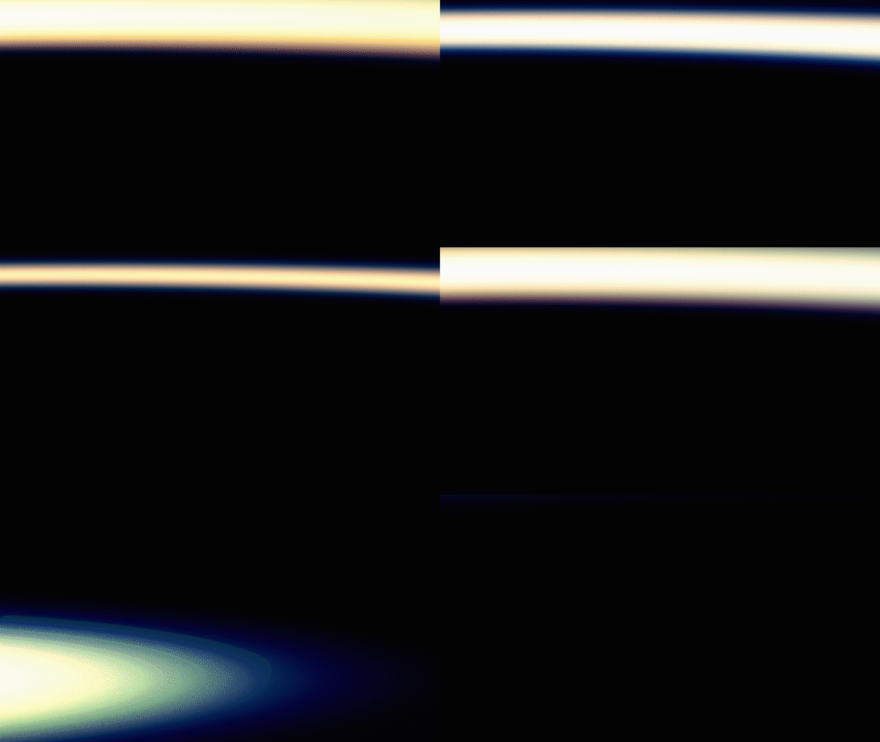
PHASE I
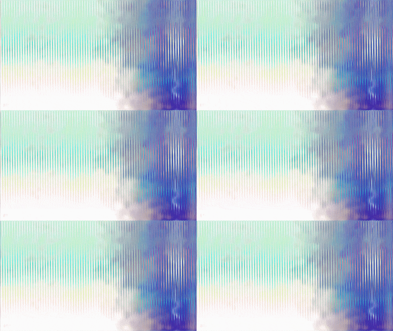
PHASE II


PHASE III
PRODUCTION DESIGN OF ORKES
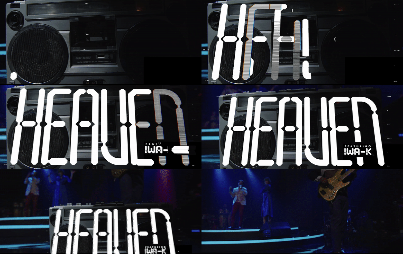
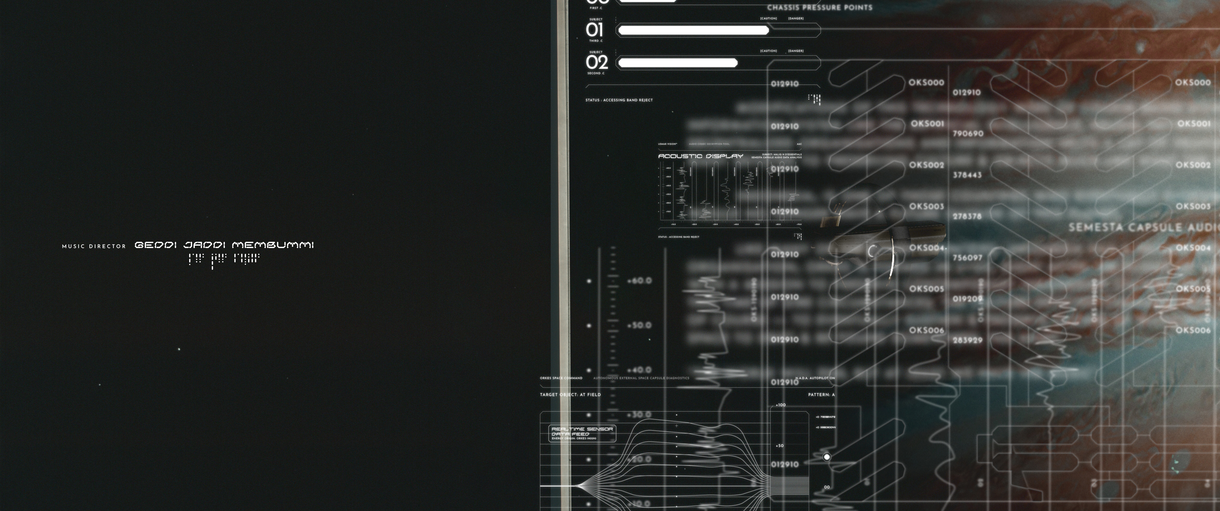
The production design of Orkes has started from the conception of the story and screenplay, furthering the relationship between the story and visuals. The technological interfaces designed is one of the film’s strongest component, they were designed in such detail, referencing past & contemporary entities & also technological accuracy; offering the full experience of interstellar space.


OPENING TITLES


INTERFACES AS LOWER THIRDS & SUPPERS


ORKES SPACE COMMAND INTERFACES
The titlecards of the respective performances were designed to evoke the in-your-face feel, a very bold & strong presence — the idea is to balance it out with the intricate, detailed technical interfaces that enrich the wide screen of the Orkes experience.
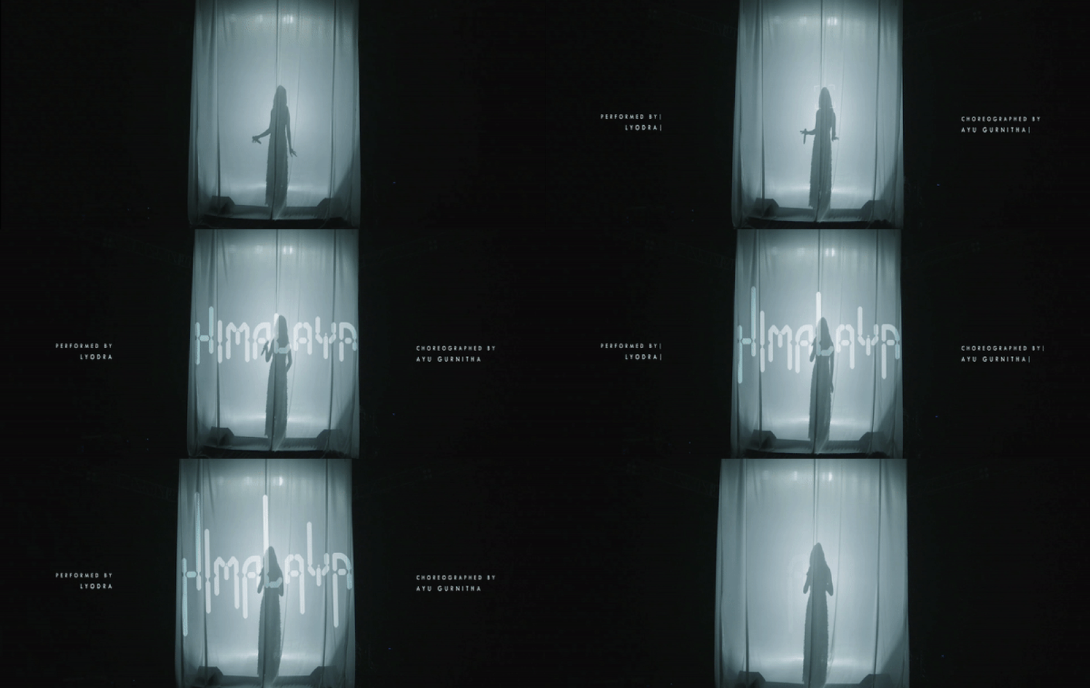
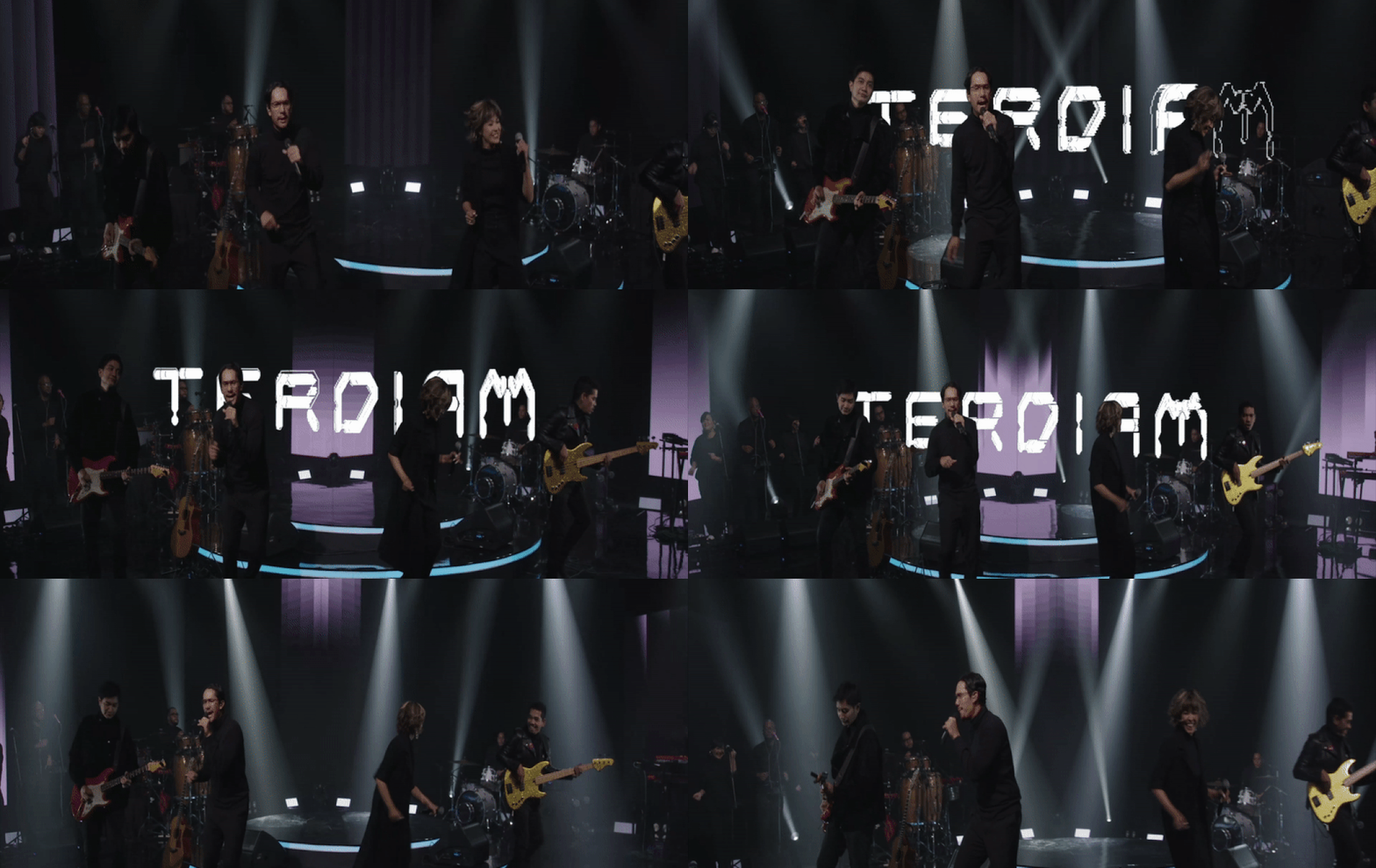
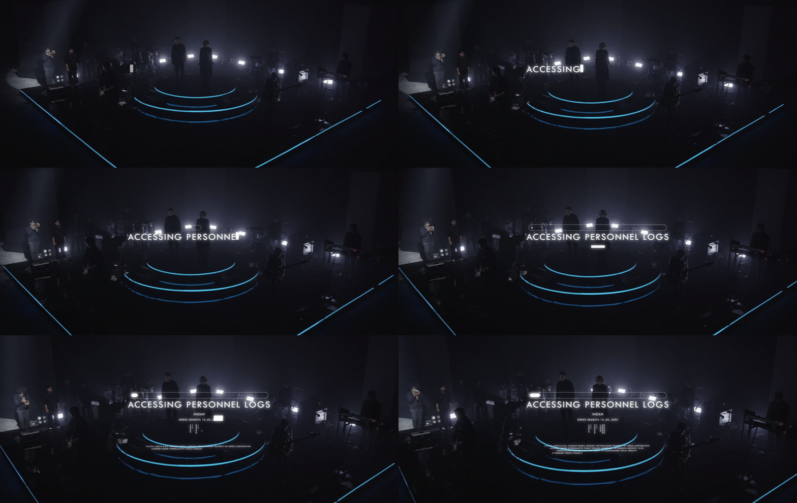
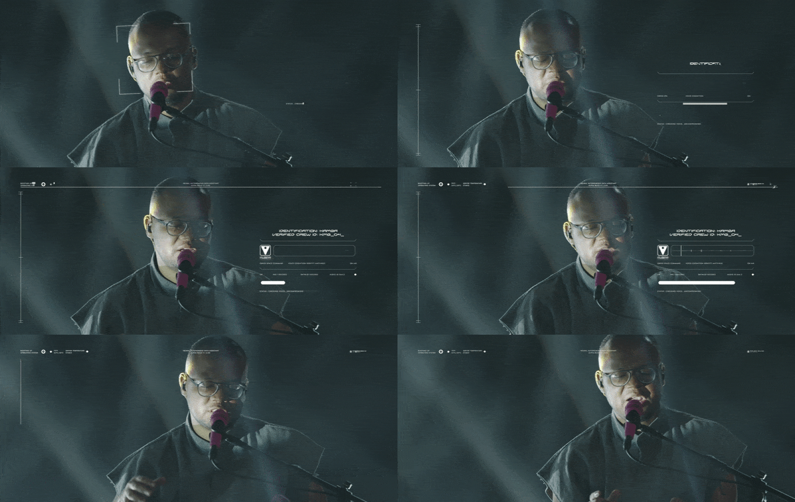
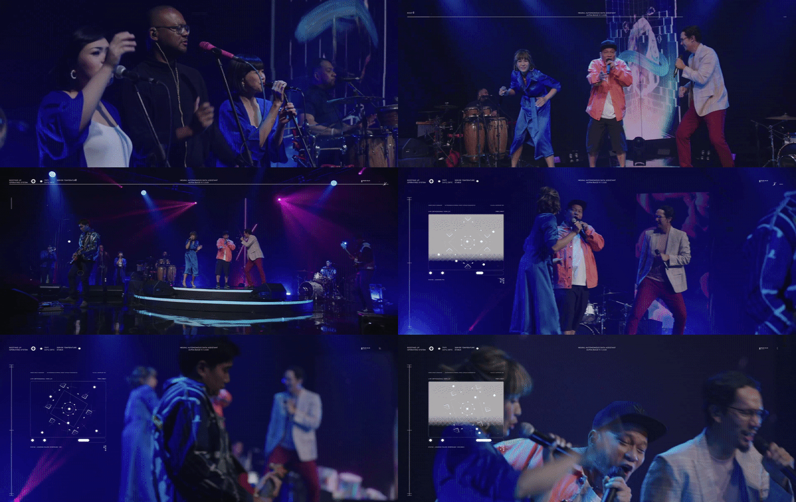

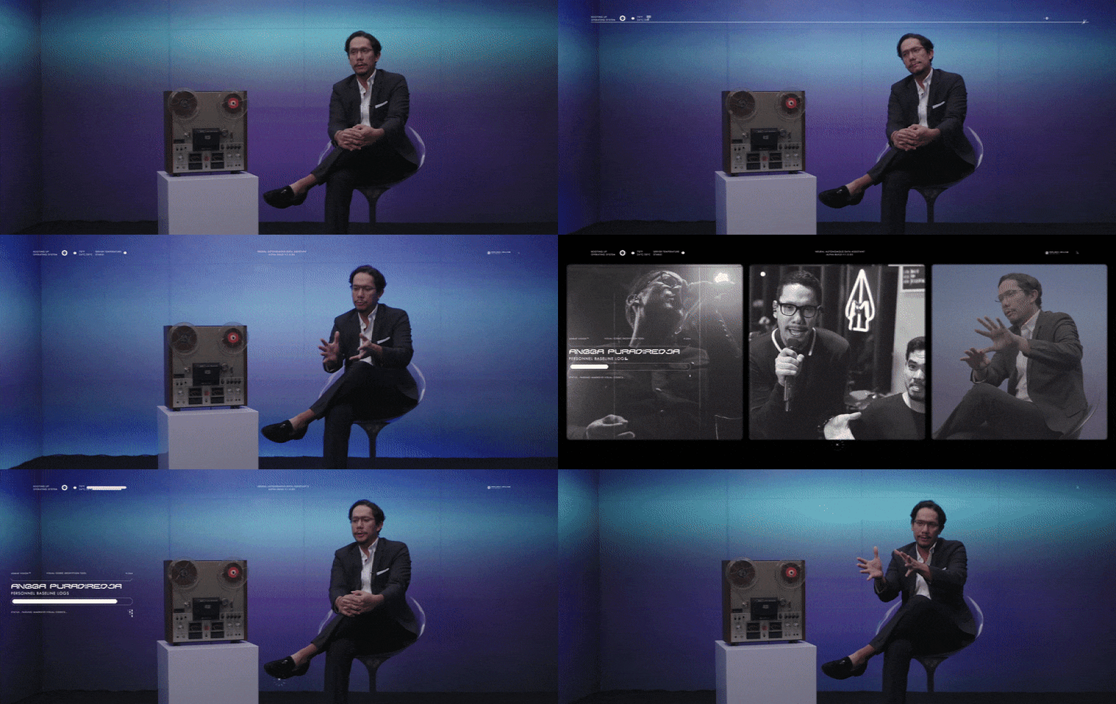
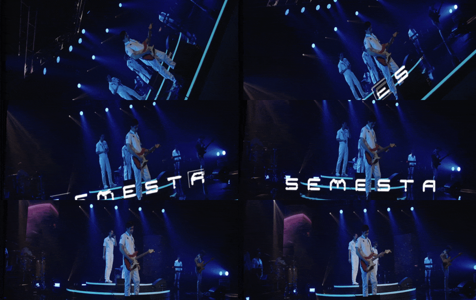
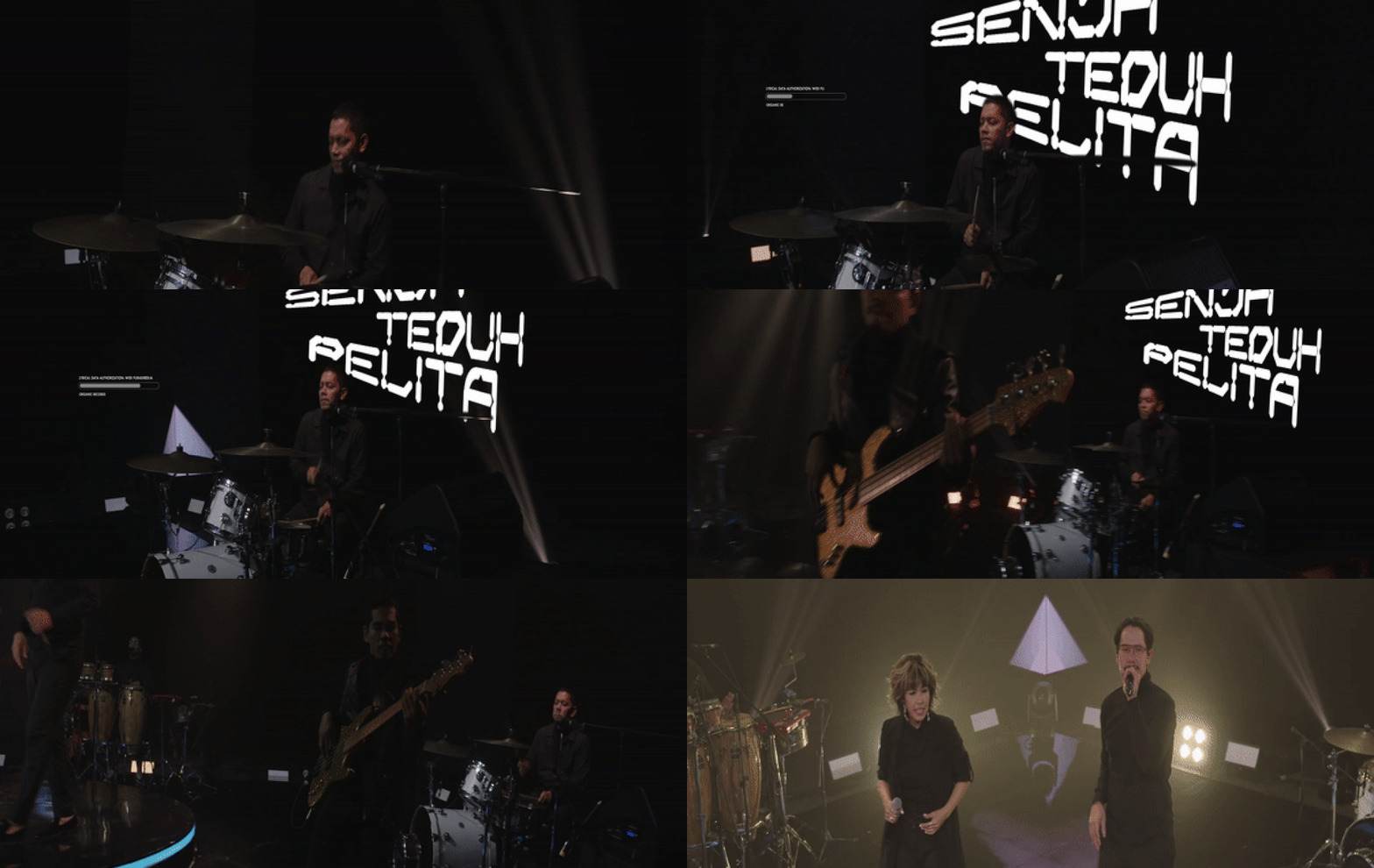
TITLES & LOWER THIRD INTERFACES
Within the ending credit titles, the designs were created from the iridescent graphics & also archival documents/visuals referencing the world of Orkes, in this medium we were able to tell more stories, to lay the foundation and the enrich the authenticity of future Indonesia. From the origins & the genealogy of Orkes, to its conception and overall future history where the story resides; it gives us more ideas where to take the future installments next.
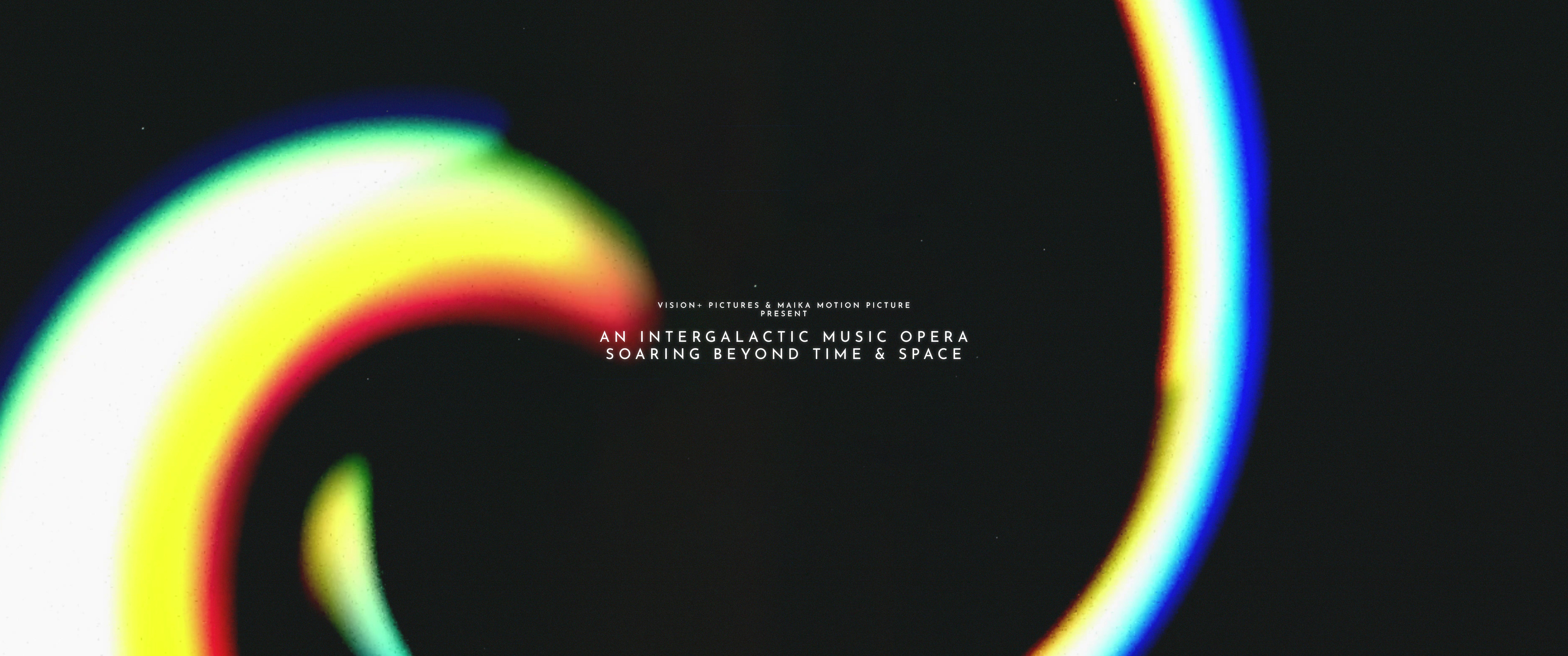
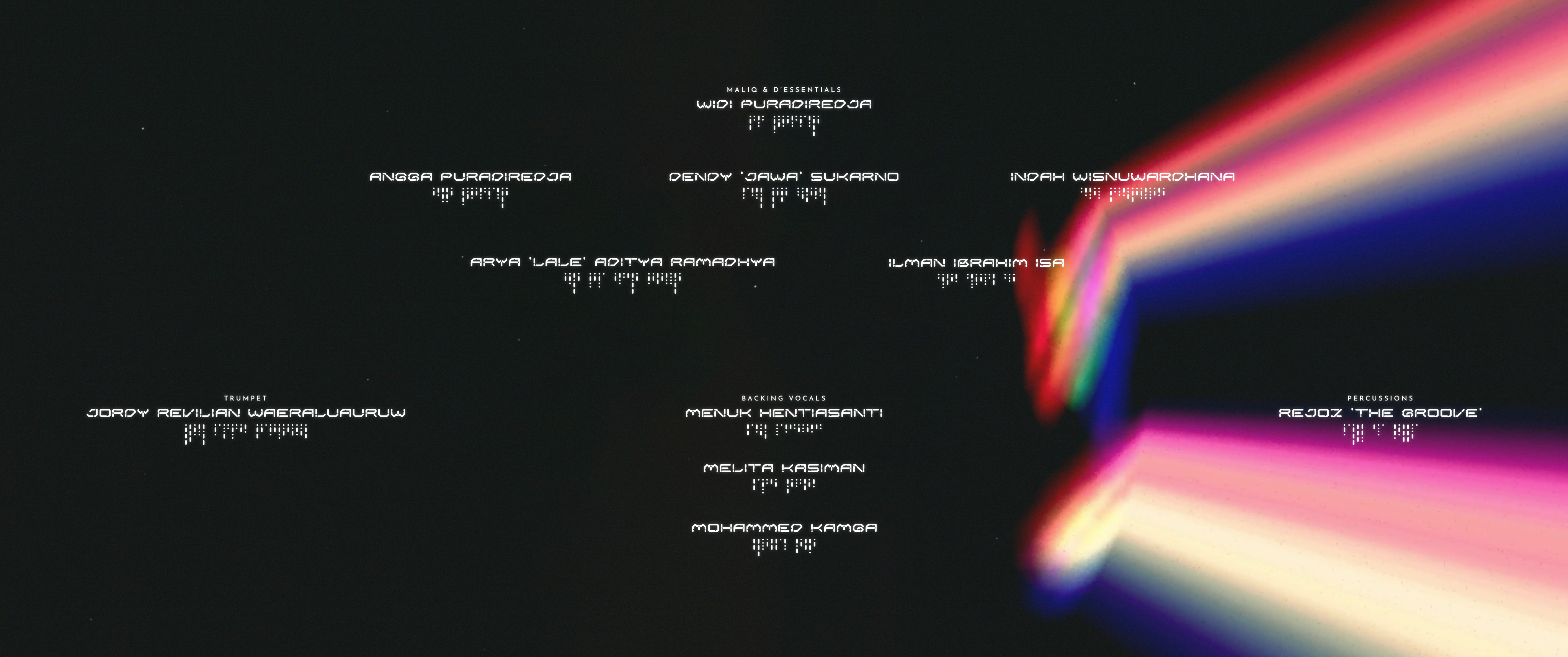
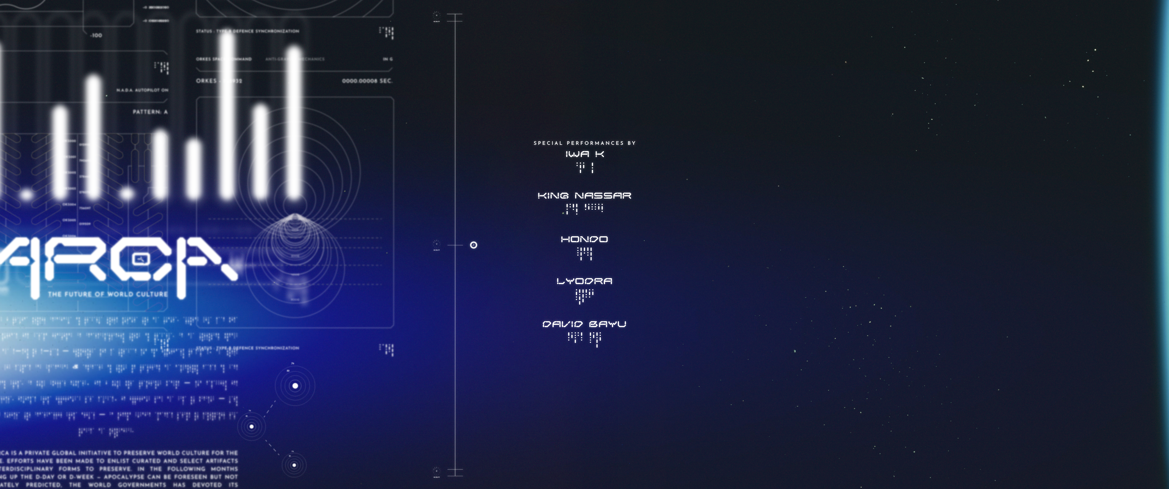


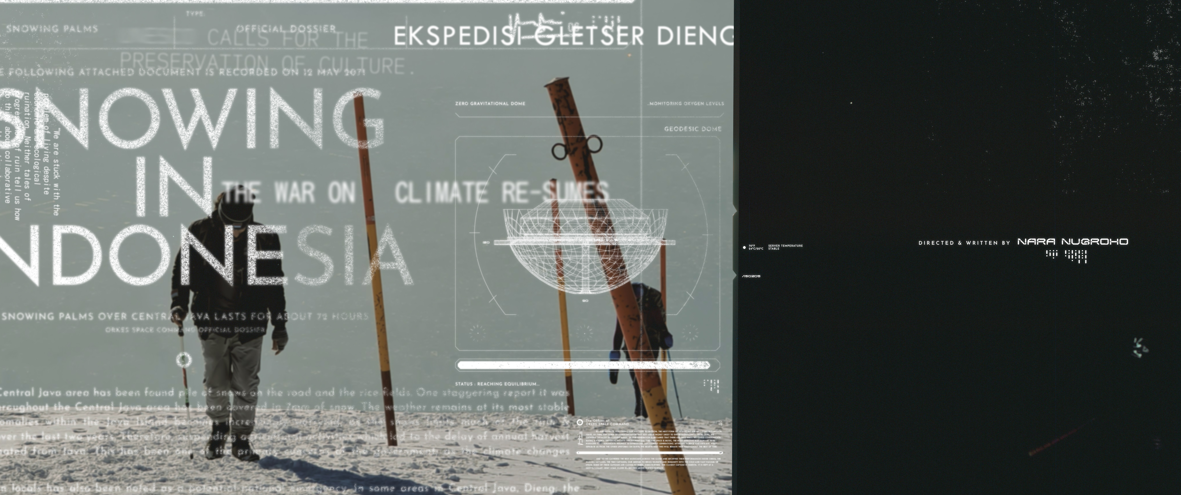
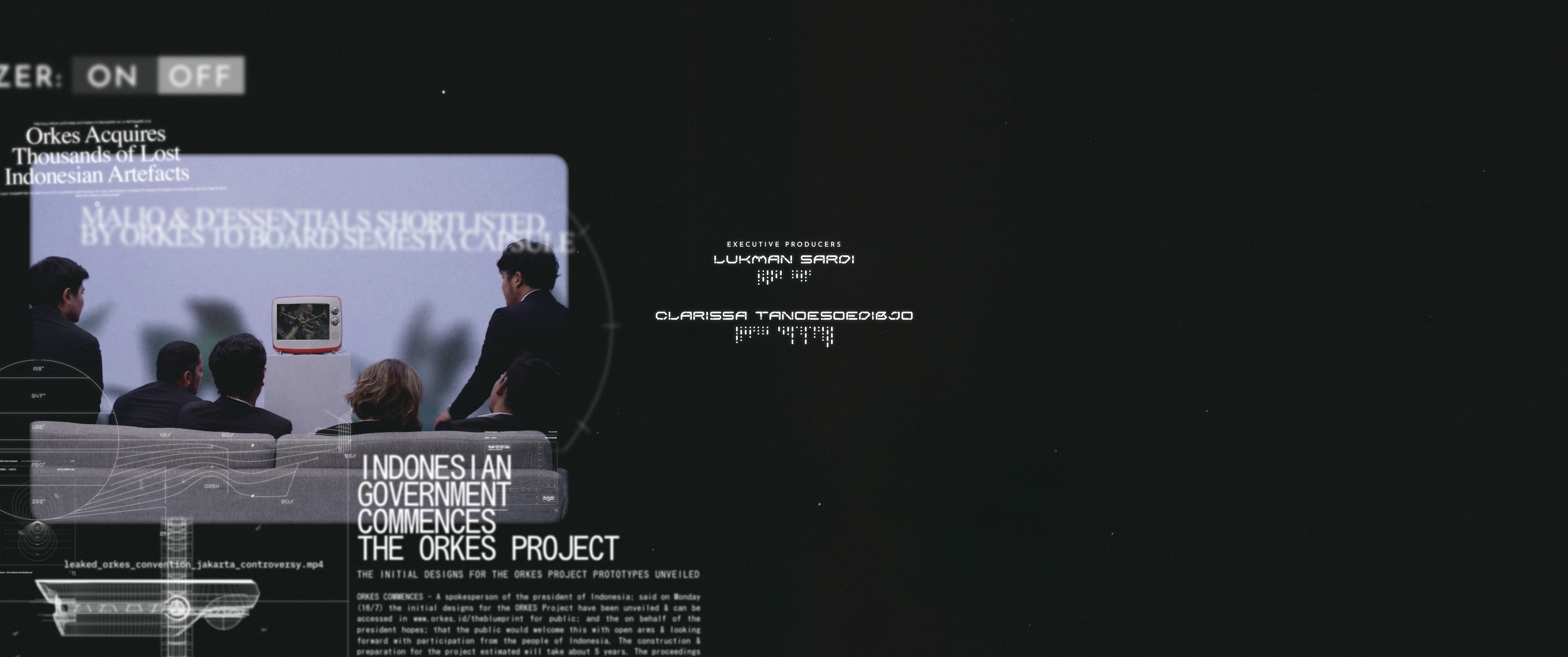
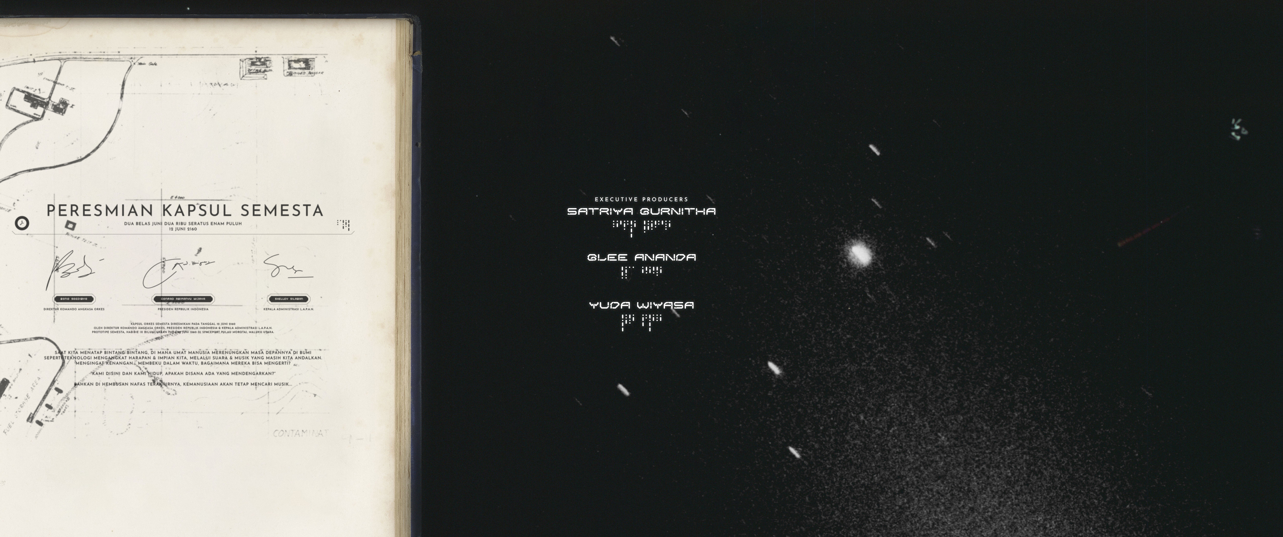
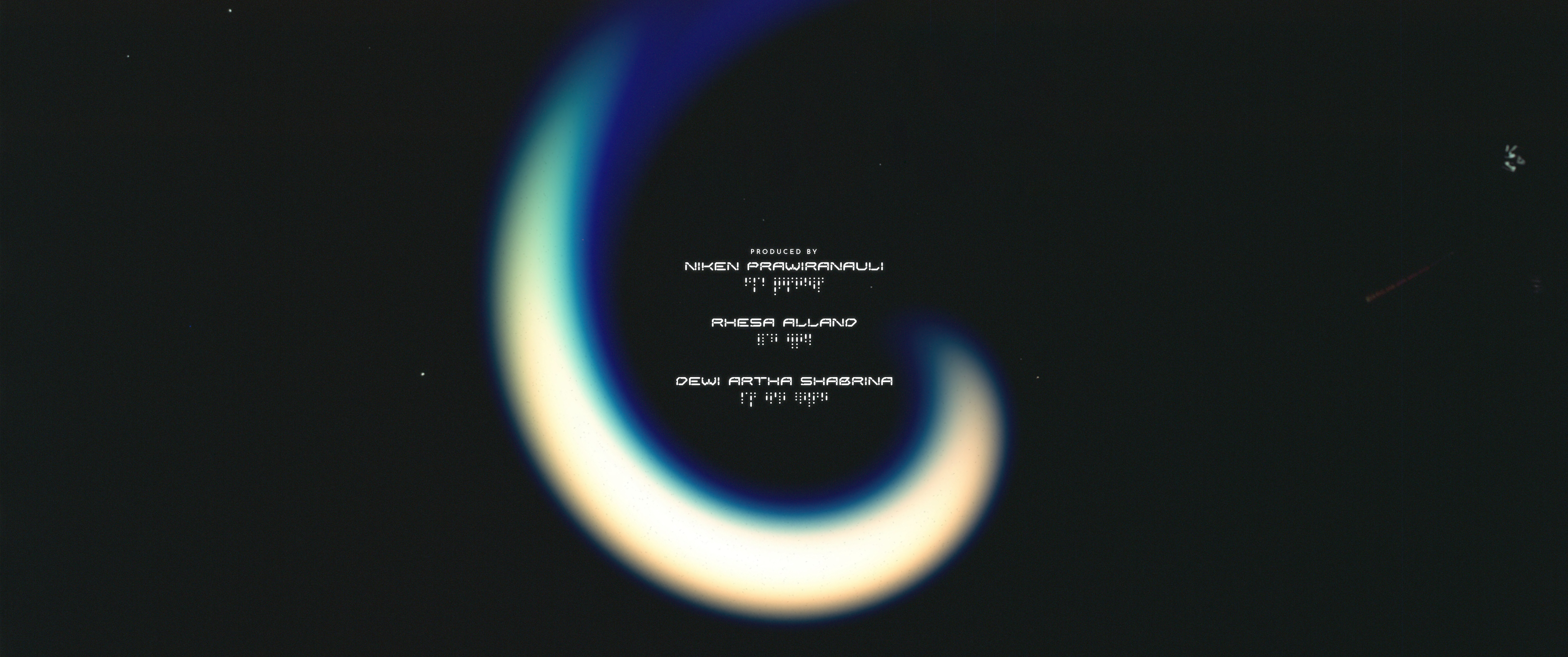

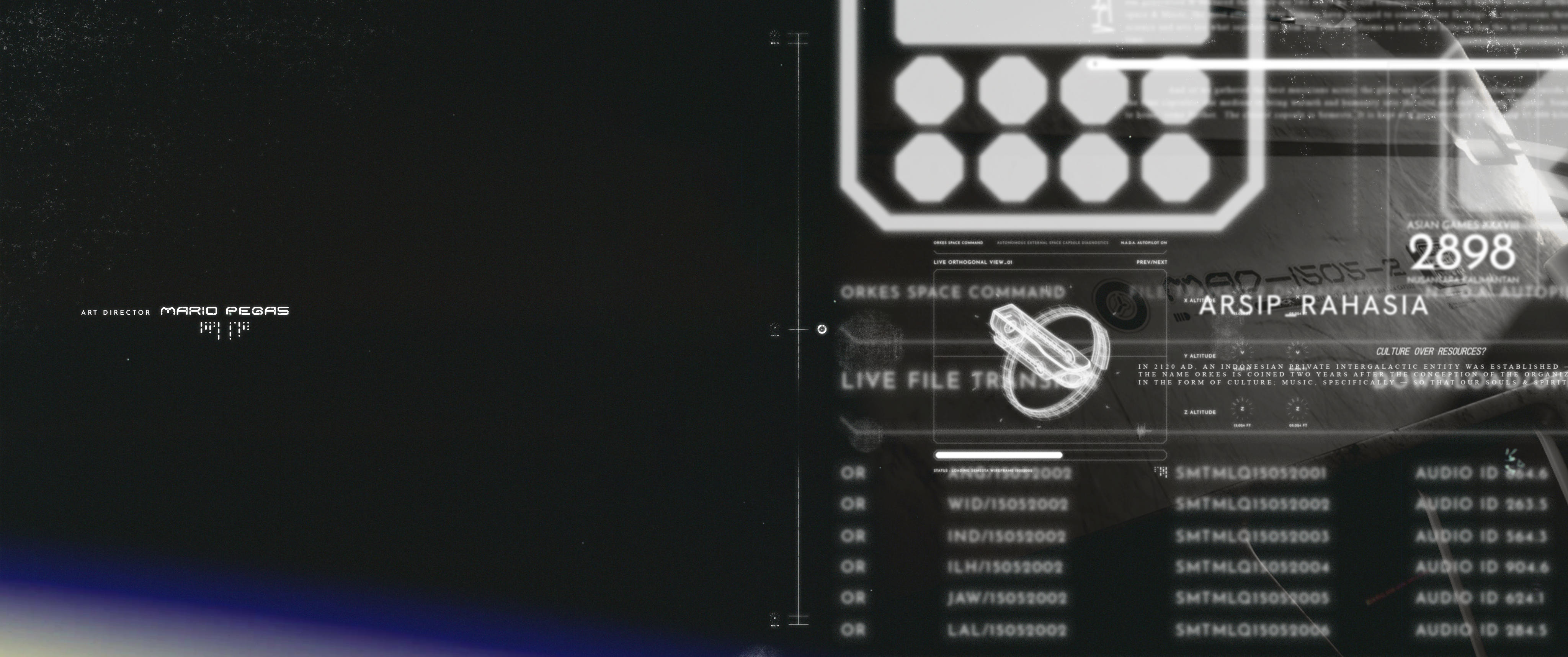
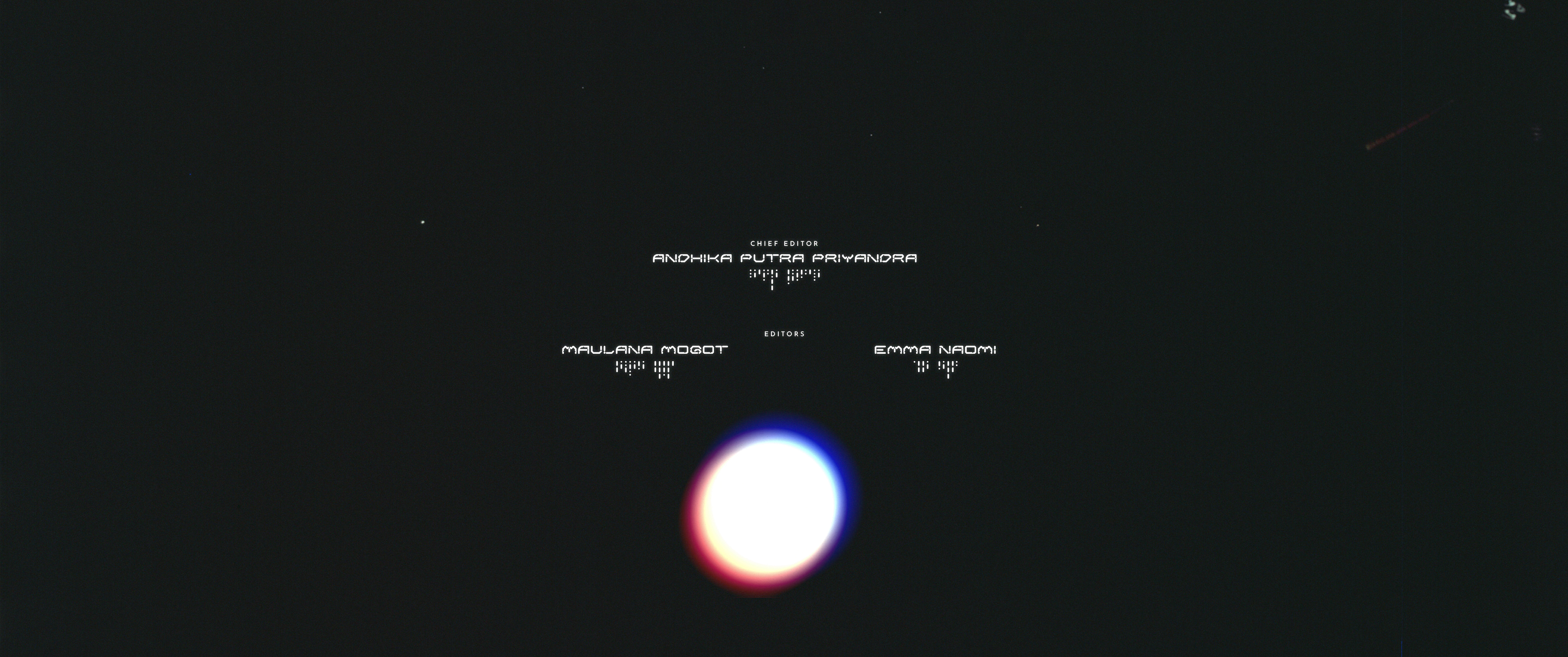
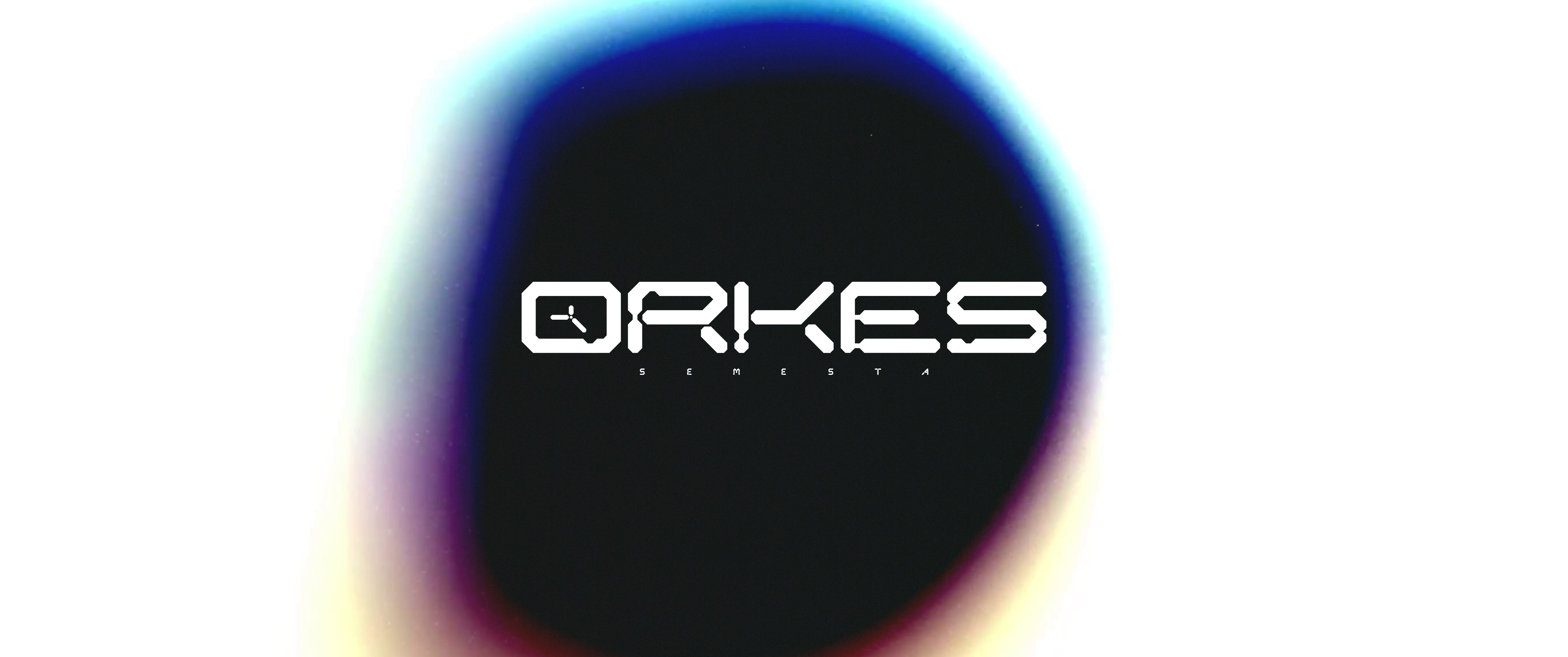
CREDIT TITLE DESIGNS
CREDIT TITLES
WORLDBUILDING & CAMPAIGNS
Following the release of the film in late May 2022, an entire backstory bible was crafted — to enrich and gain traction of interest in the film. We created marketing campaigns such as N.A.D.A.’s launch (artificial intelligence aboard the ship of Orkes) in a fictional Indonesia Tech Expo, crafting and perfecting the authenticity of Orkes’ universe and story. Other campaigns such as the news bulletin & archival documents regarding the launch of the Orkes capsule were also told to evoke mystery & intrigue for the audience leading up to the launch.
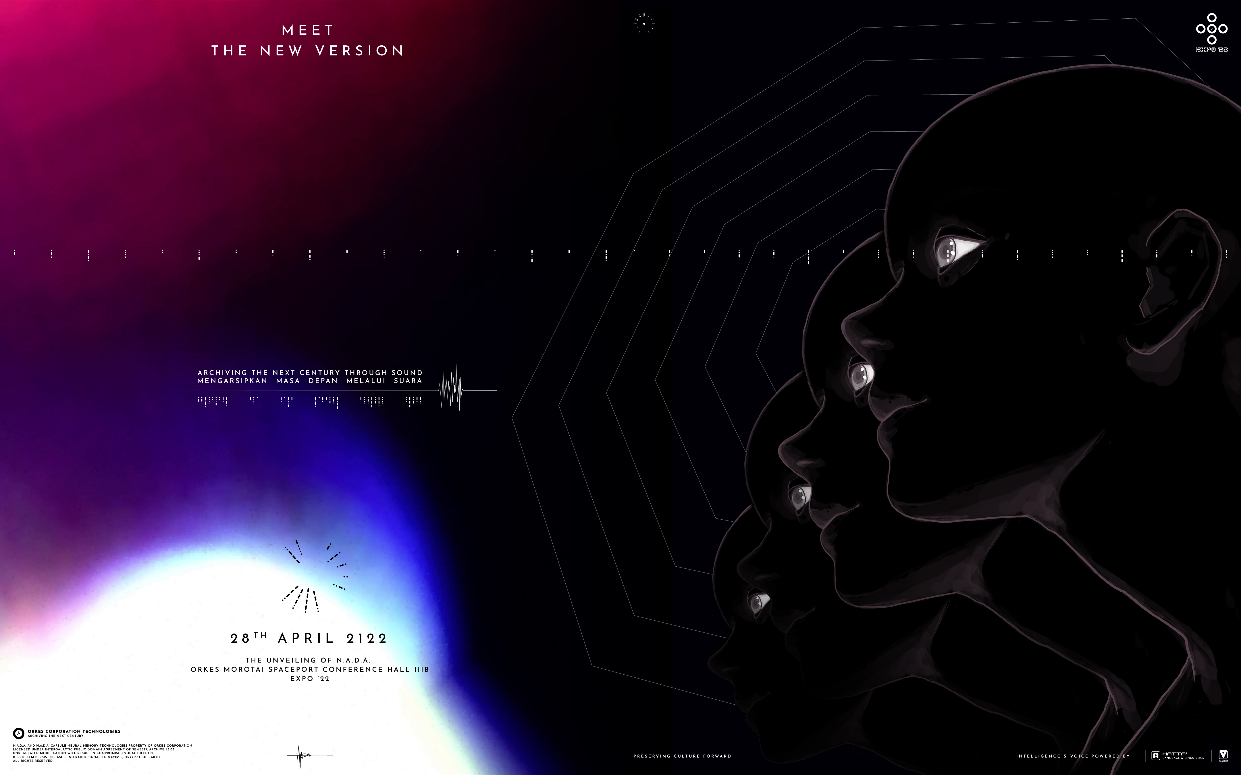
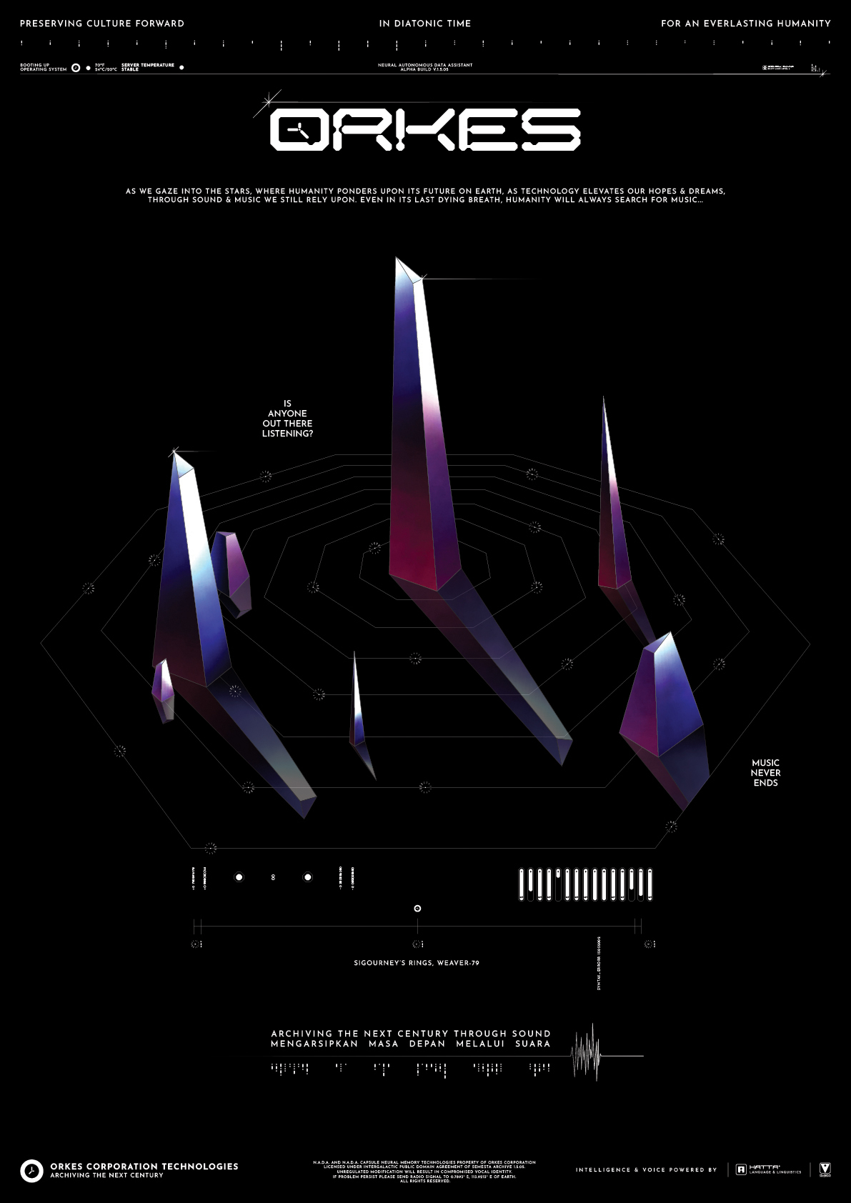
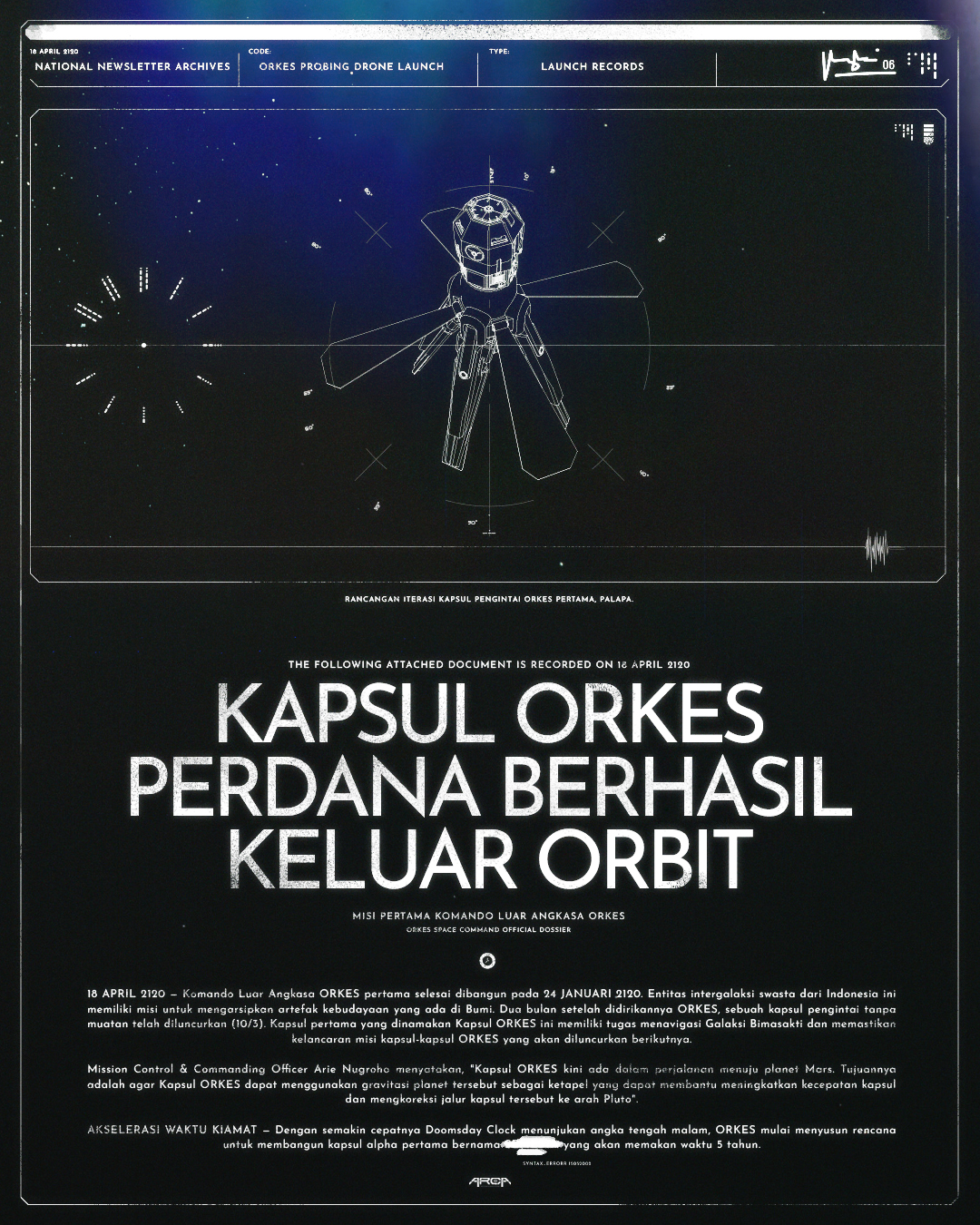
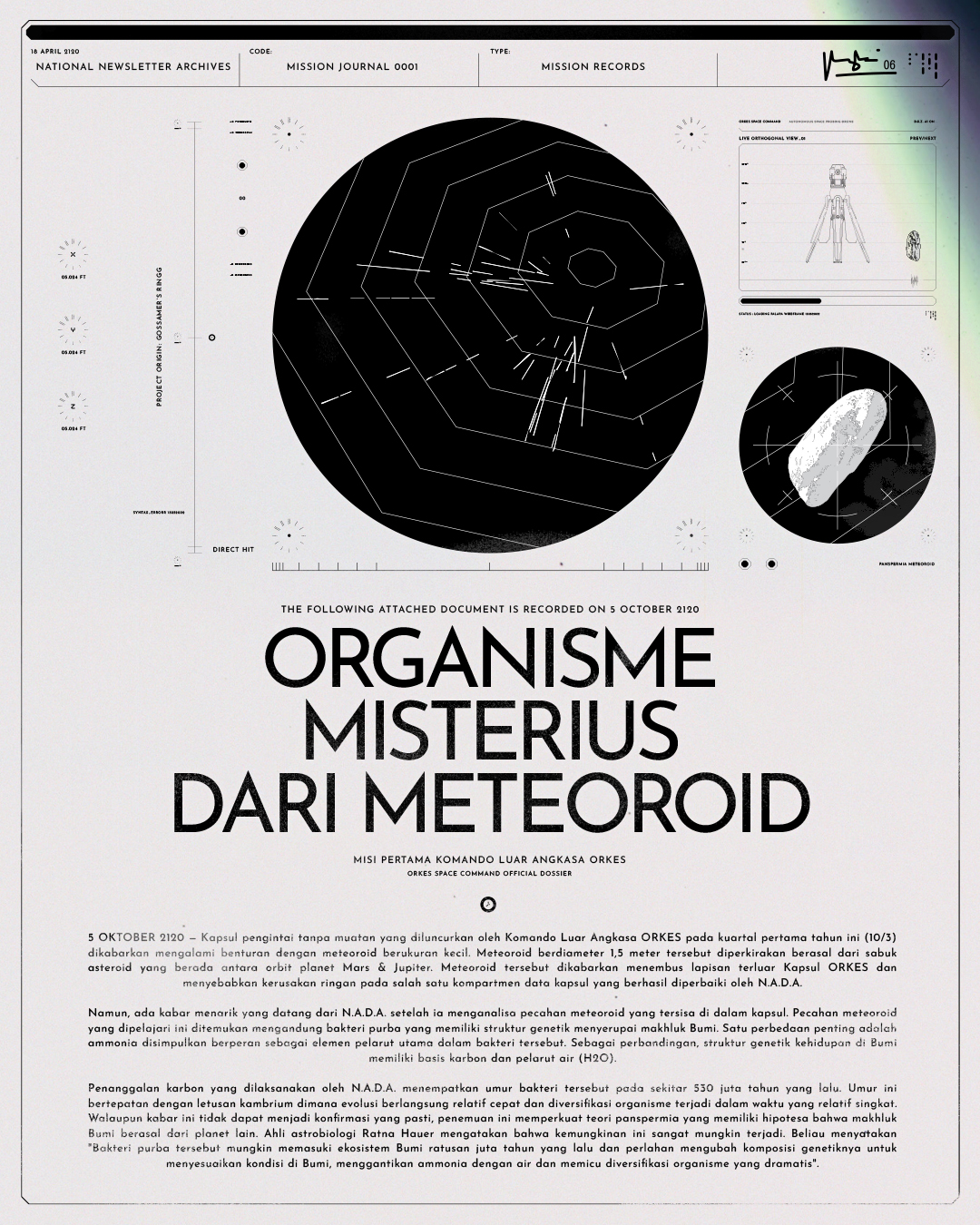
WORLDBUILDING MARKETING COLLATERALS
TEASER POSTERS
Teaser posters featuring the overall film mood & worldbuilding in a mysterious manner, the idea is to not give away instantly about the film. This is to create variants of posters & build the hype for the film. The poster is created from the generated strobe light ambient graphics to further portray the technicolor & vastness of space.
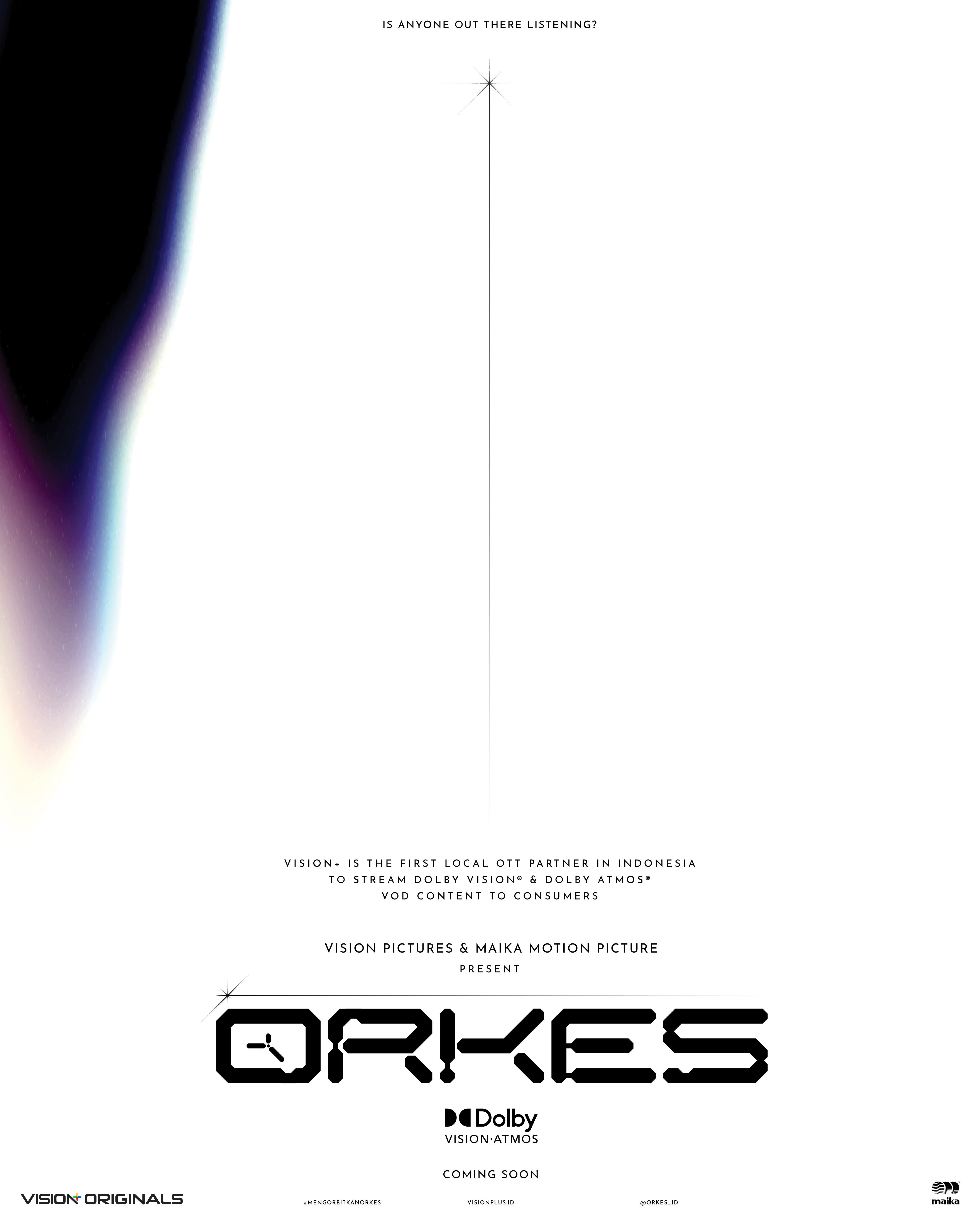
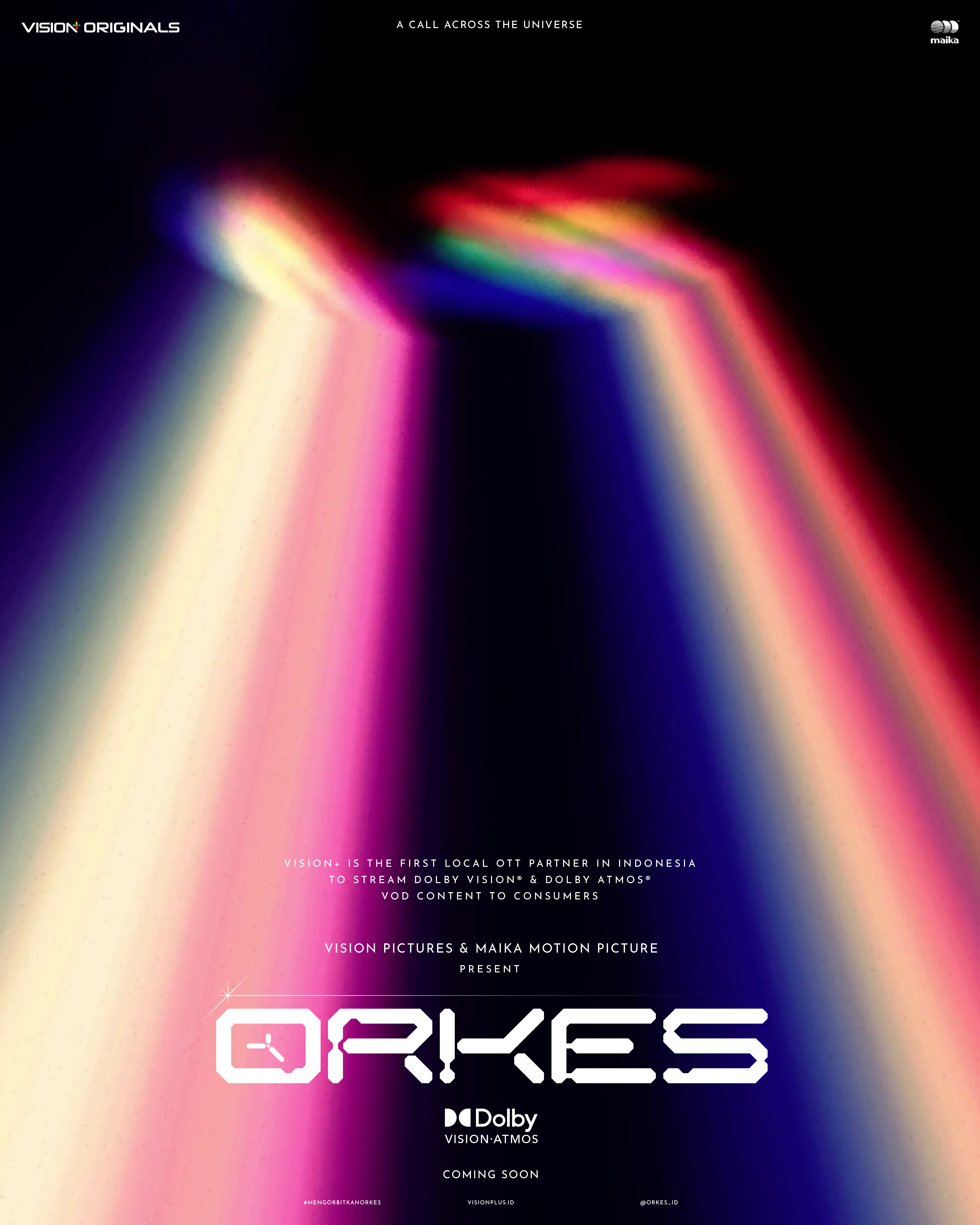
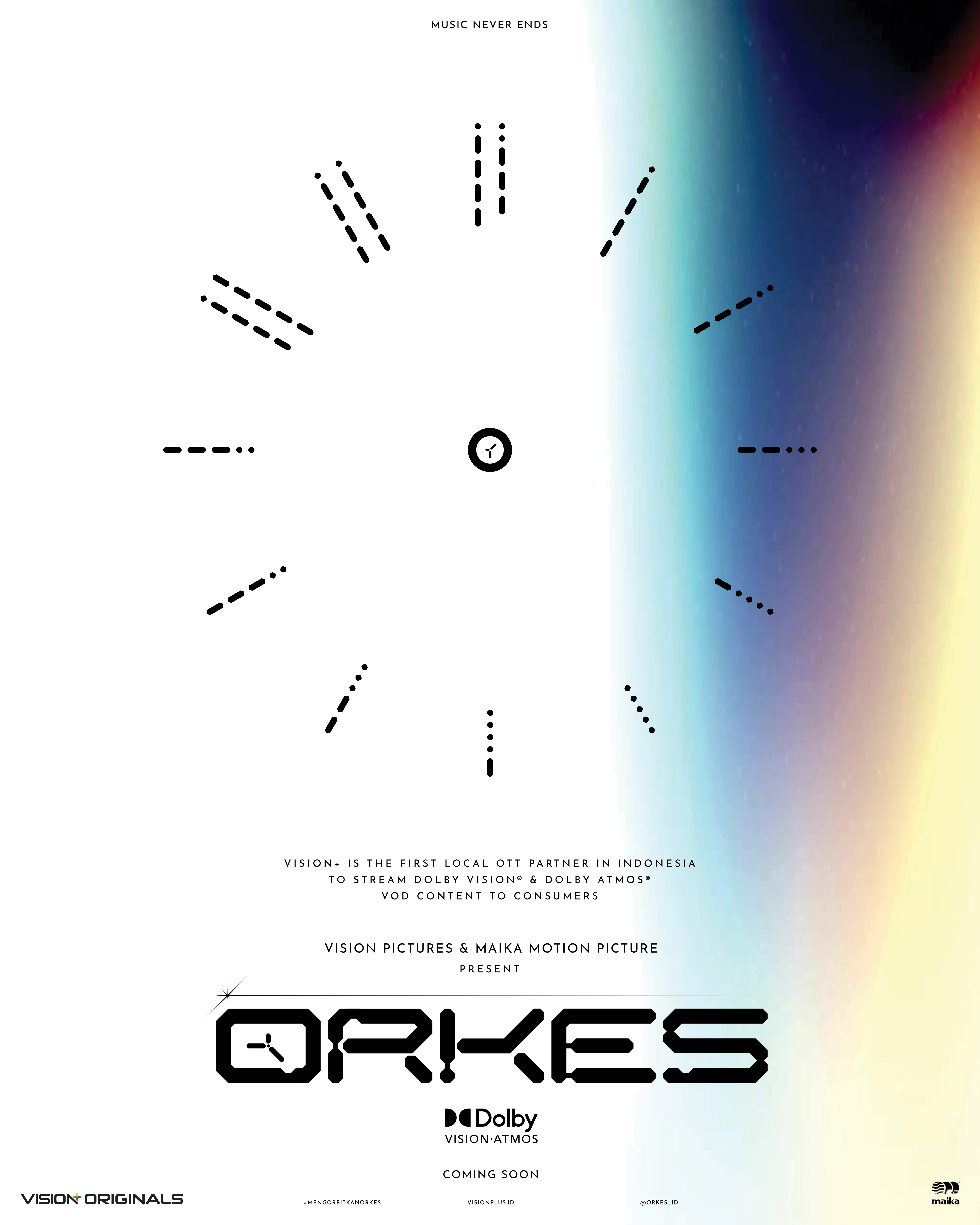
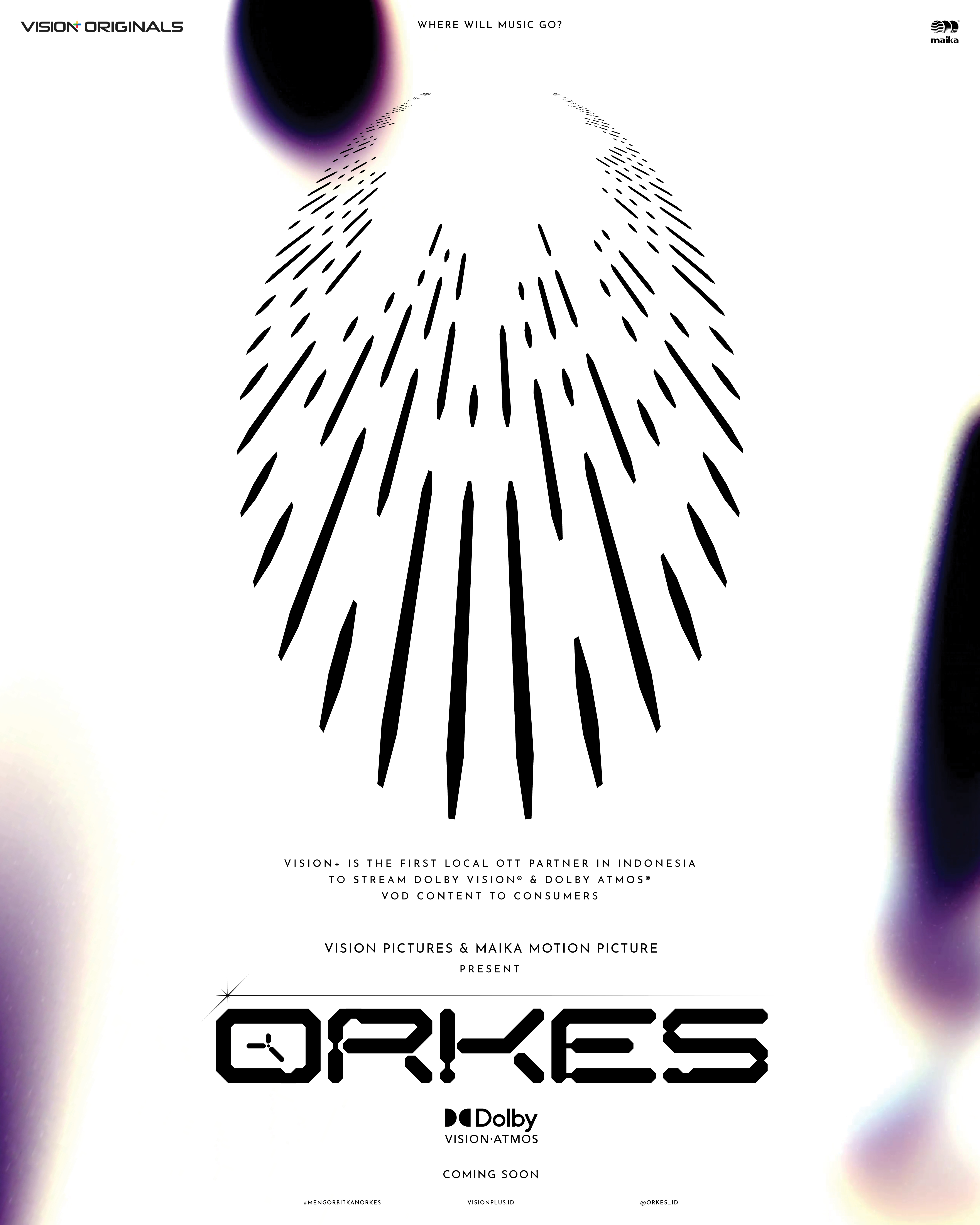
TEASER POSTERS
MAIN POSTERS
The concept for the main poster has always been in the form of painting/illustration — in the tradition of classic science-fiction posters. Romance & grandeur was the key goal in creating the poster, featuring the characters (Maliq & D’Essentials) evoking a sense of future nostalgia, to further promote the film in the manner in which the story was told.

MAIN POSTER

