
CAPSULE DISPLAY REGULAR
DISPLAY TYPEFACEType of Work
Typography
Type of Client
Entertainment & Music
Typography
Type of Client
Entertainment & Music
Role
Designer
Team – Collaborators
* IMG- Maika Collective Studio (Agency)
Designer
Team – Collaborators
* IMG- Maika Collective Studio (Agency)
Category
Display
Styles
Regular
Display
Styles
Regular
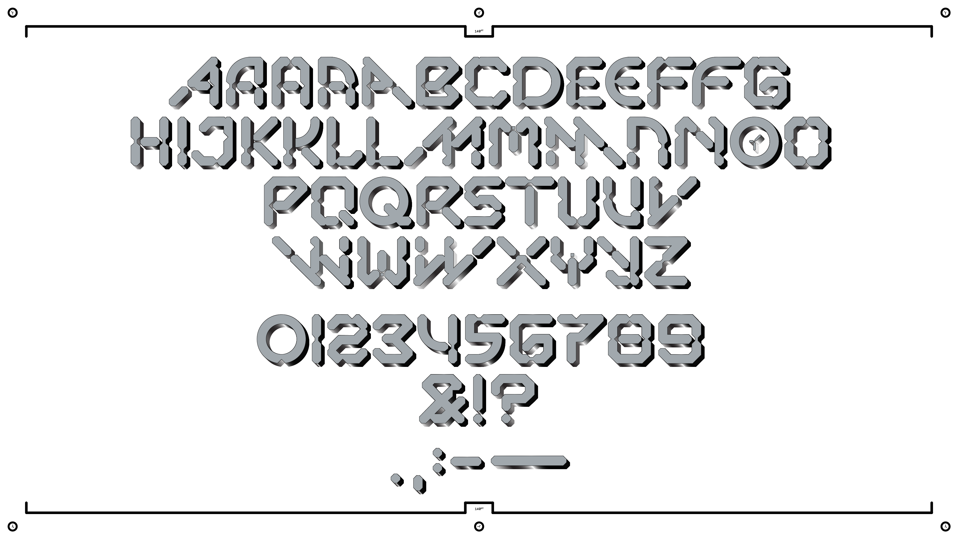
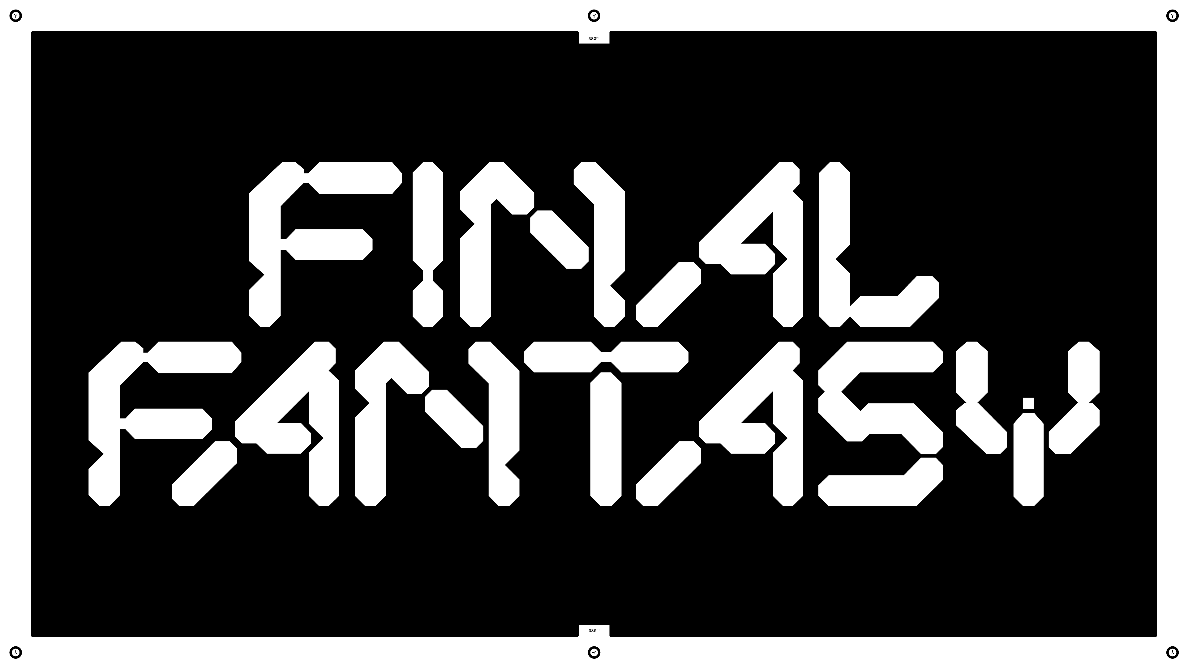
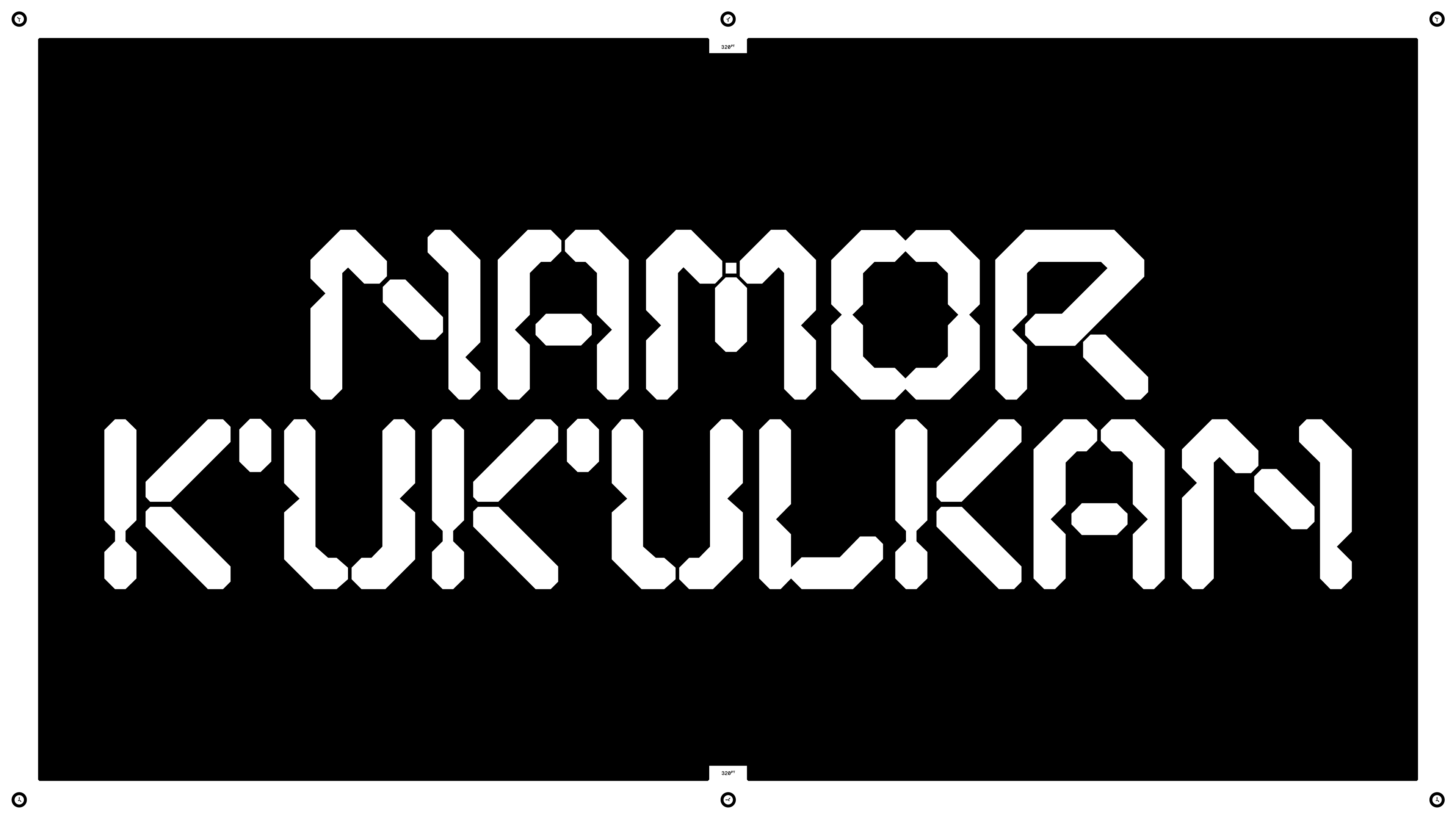
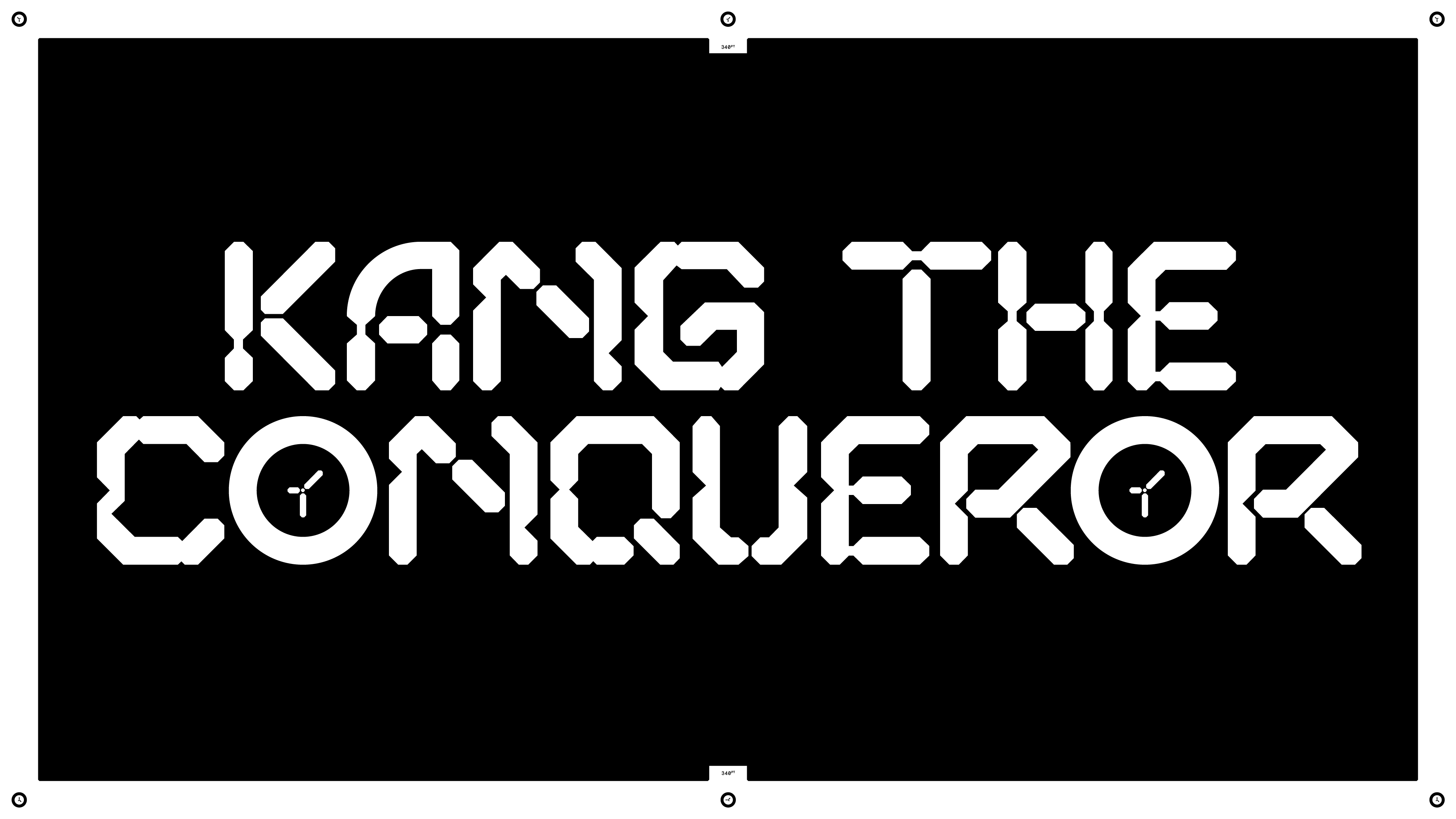
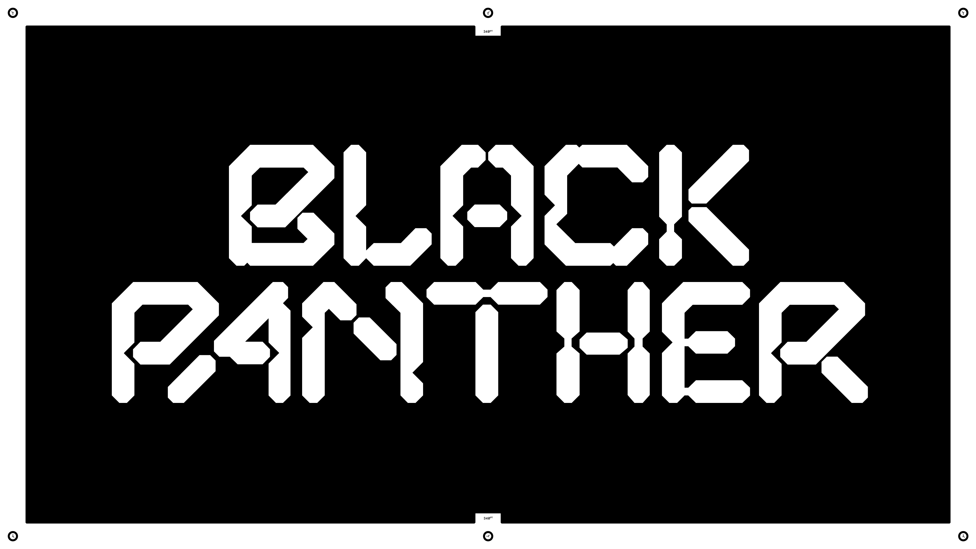
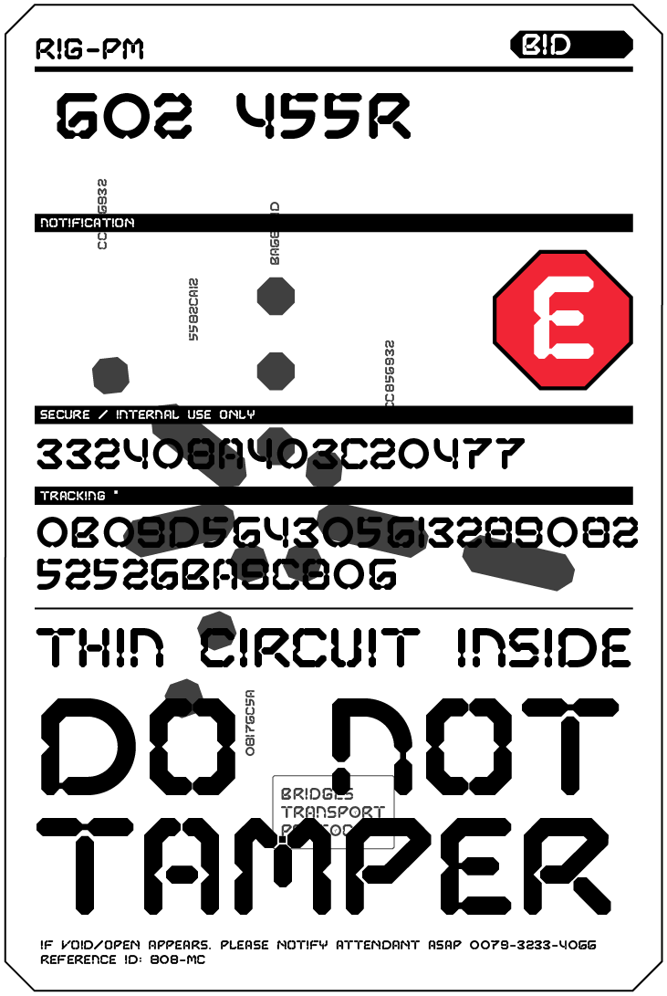
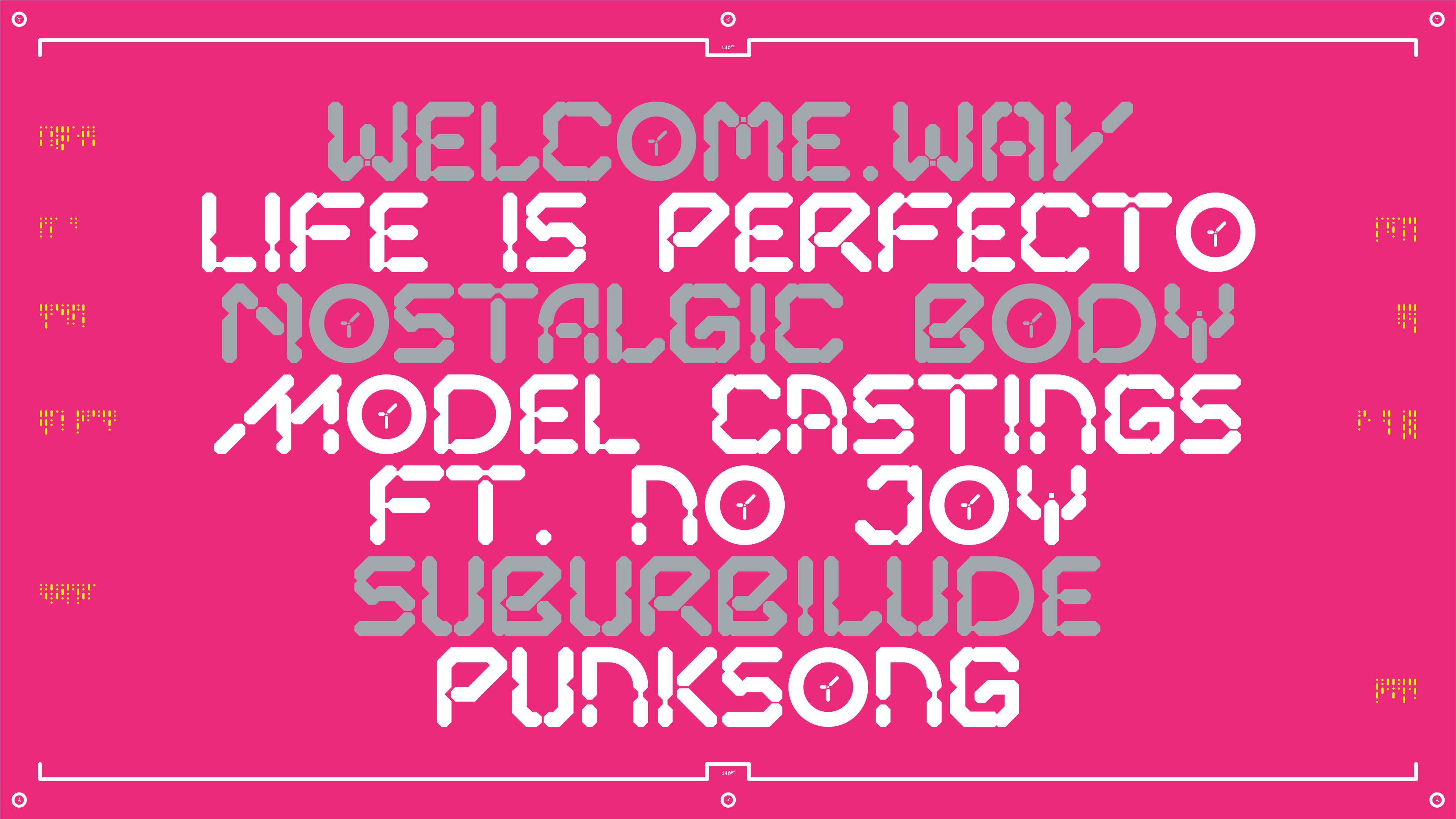
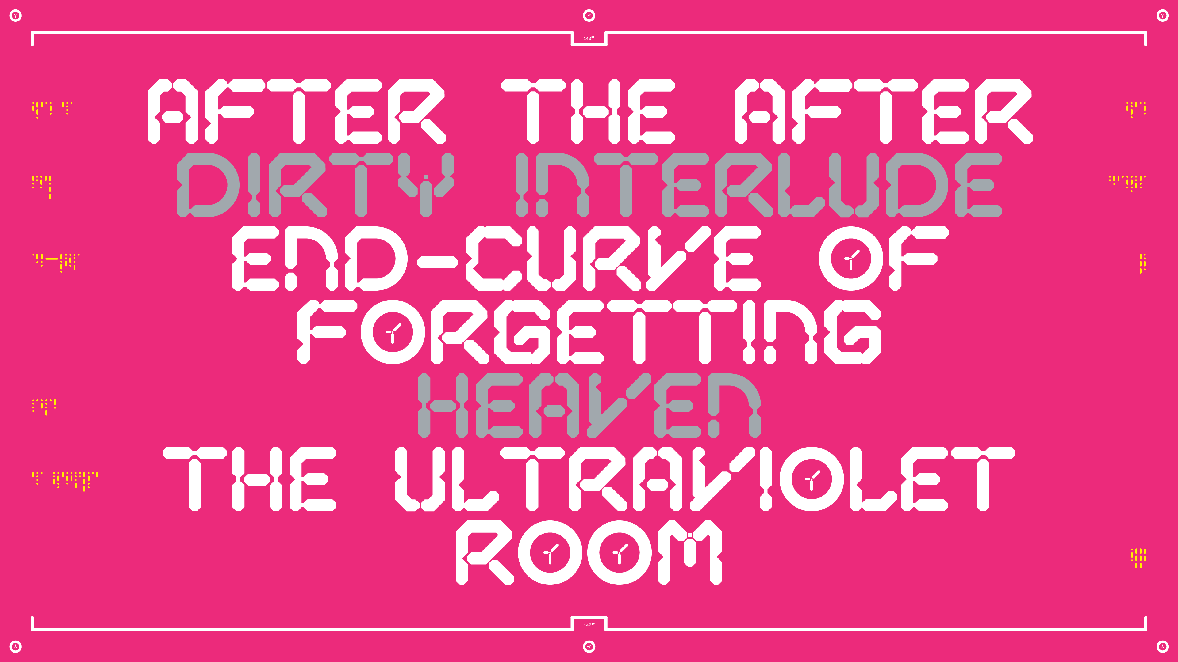
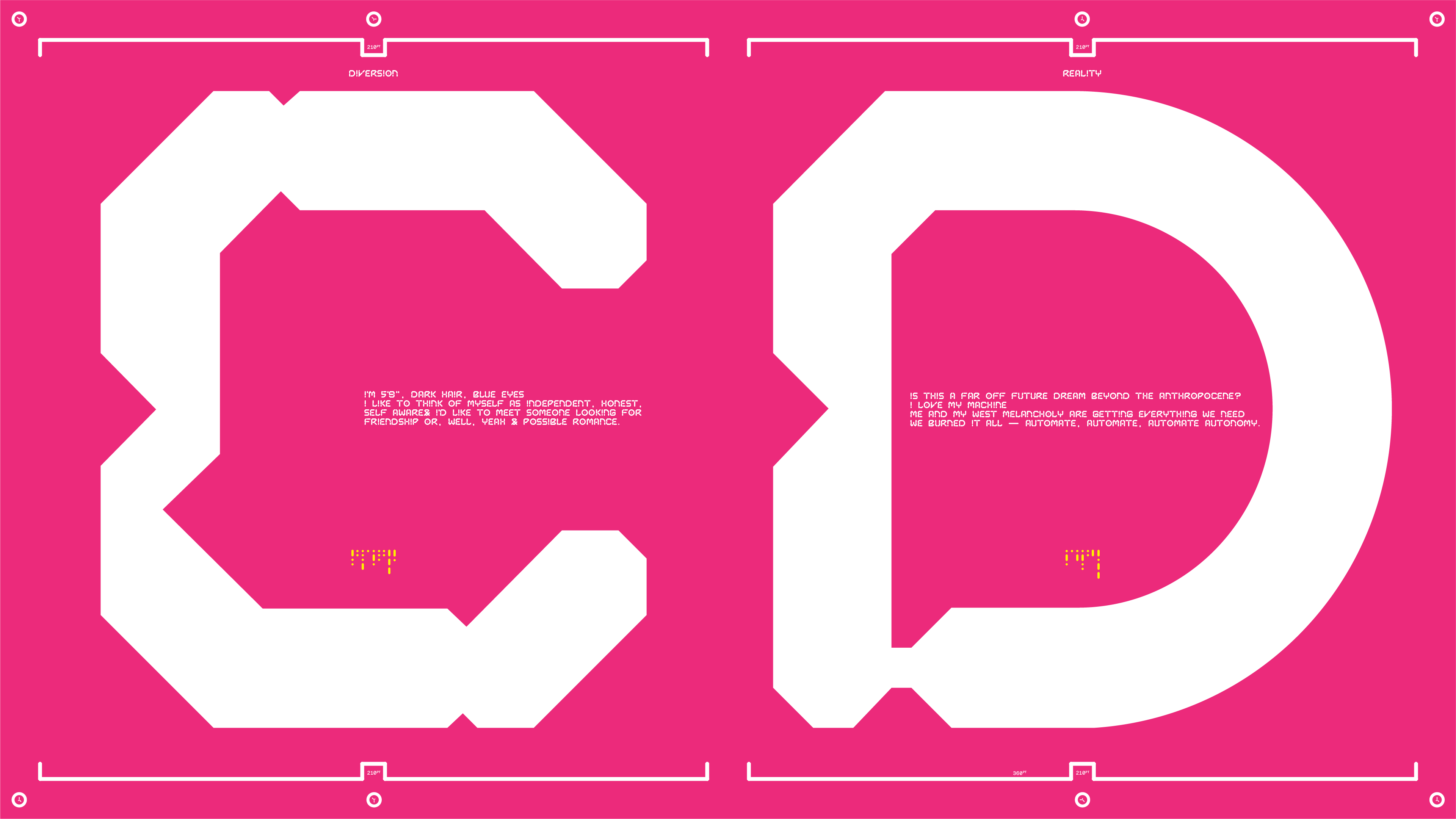
Capsule Display Regular
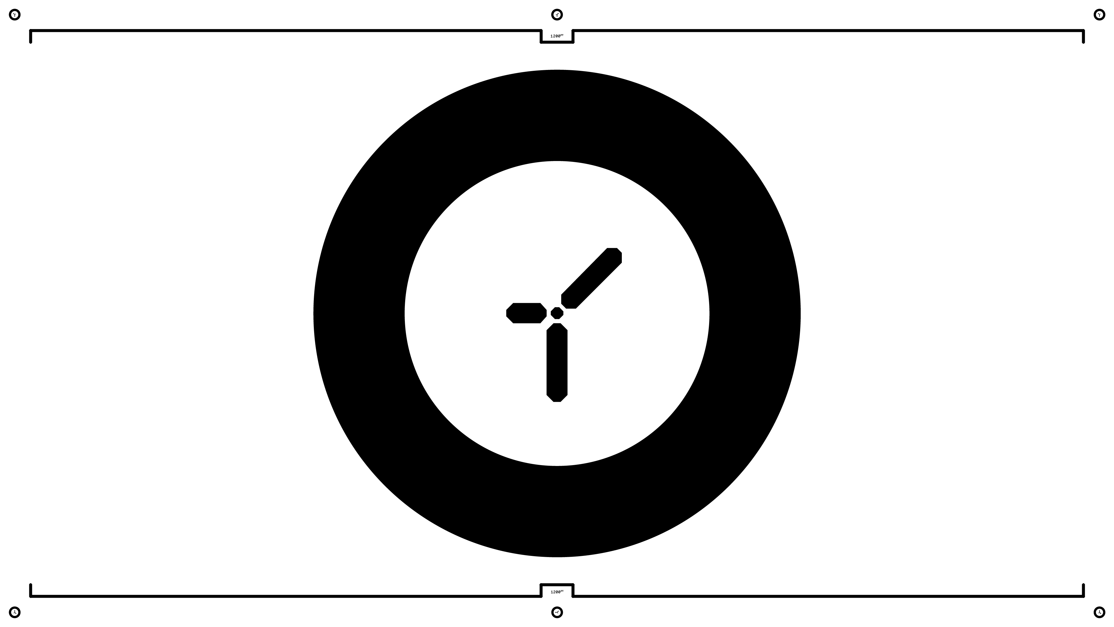
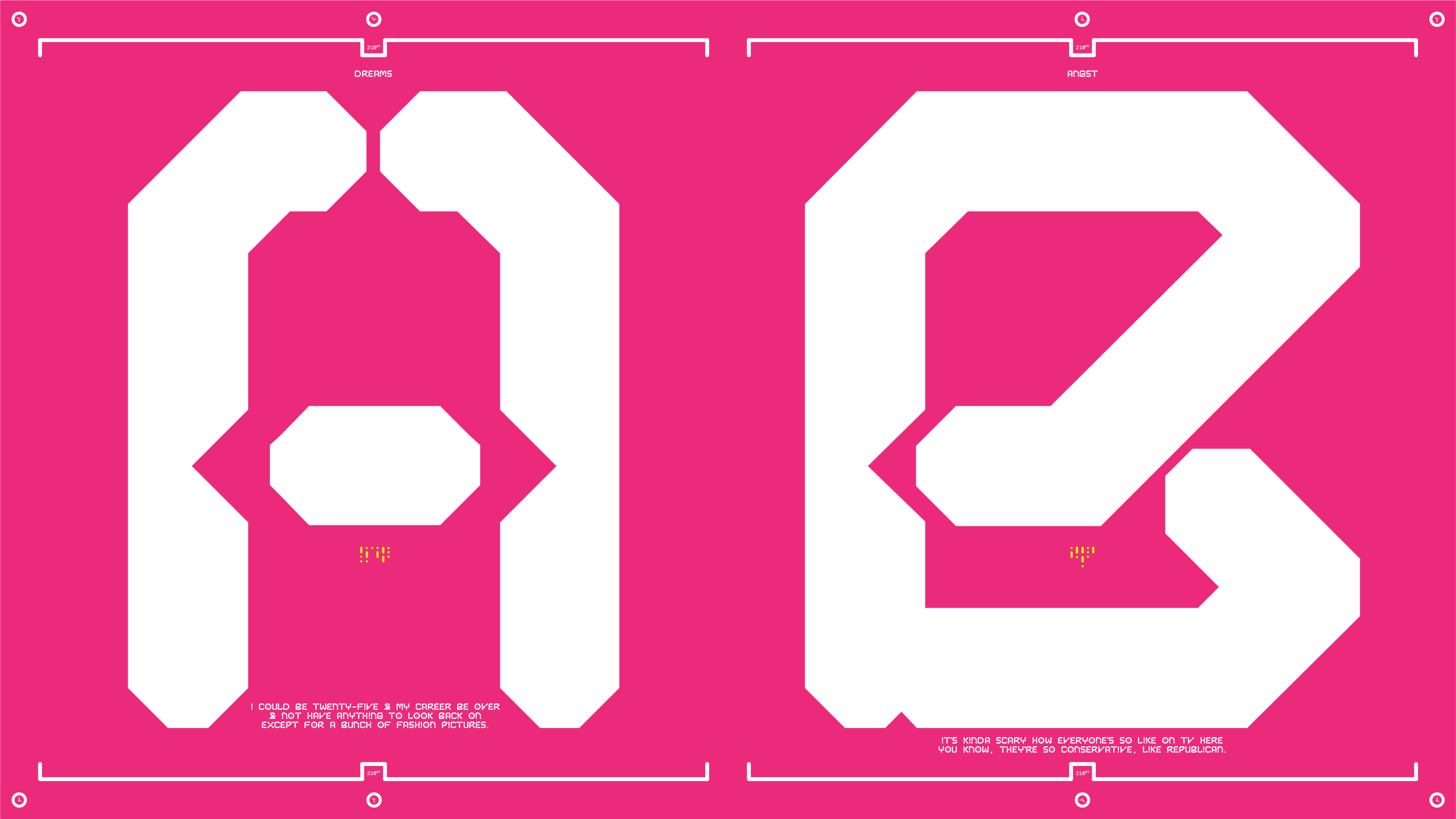
Capsule Display Roman is geometric display typeface as one of three styles in the family. As the naming indicates, Capsule Display has been designed specifically for the IP of Orkes Semesta, most notably a custom, bespoke typeface for the logotype & main identities of the film. The typeface portrays the theme of time preserved (therefore capsule) in the context of technology — which was the themes of the film.
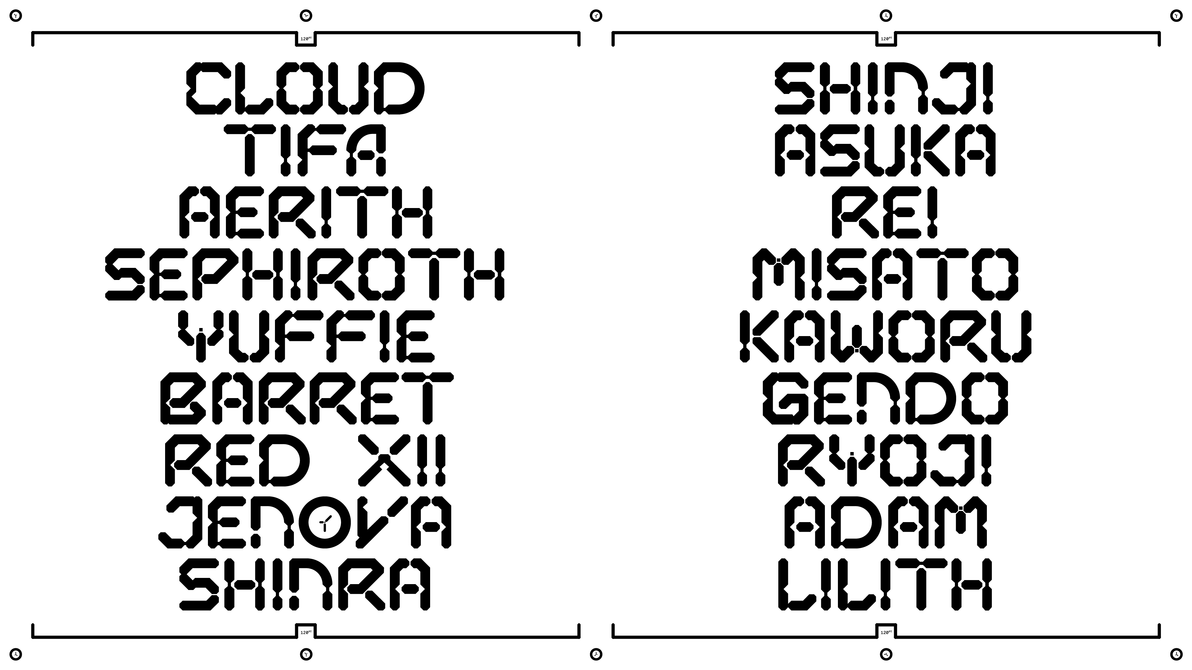
Appropriating & inspired of digital time, digital watches & clock — mimicking the aesthetic of both digital lettering in contemporary clocks. It’s very nature is deeply inspired by the generic portrayal of futurism, allowing the user to express and treat the typeface in a arbitrary manner.
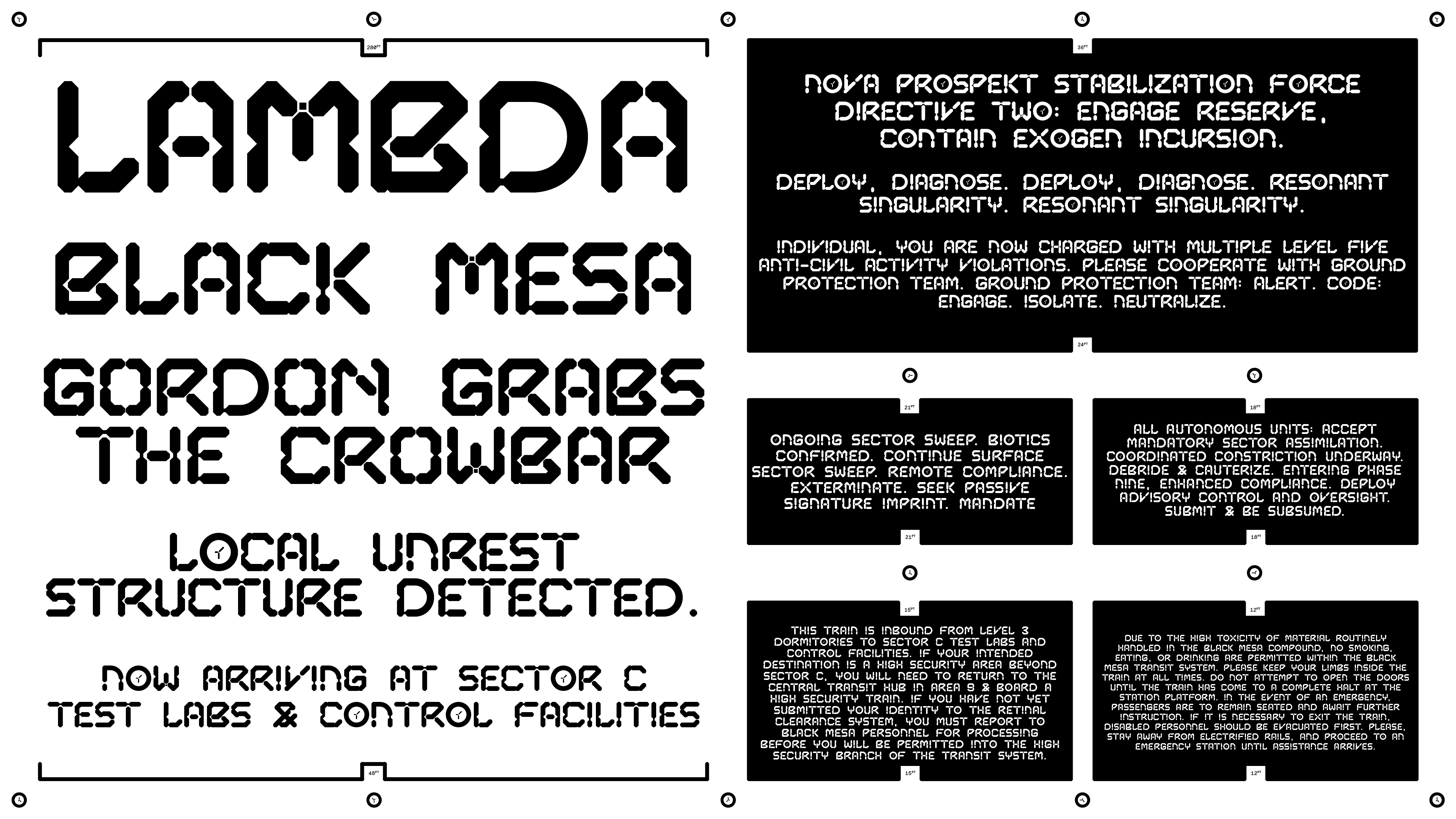
Capsule Display employs a systemised design that generates form and structure based on the musical diatonic scale & the polygon-based digital digits found in known digital time interfaces. This base form is a start of the visioning for both the visual identities of the entity as a whole, informing its rich library of conceptual & visual references.
Usage Notes
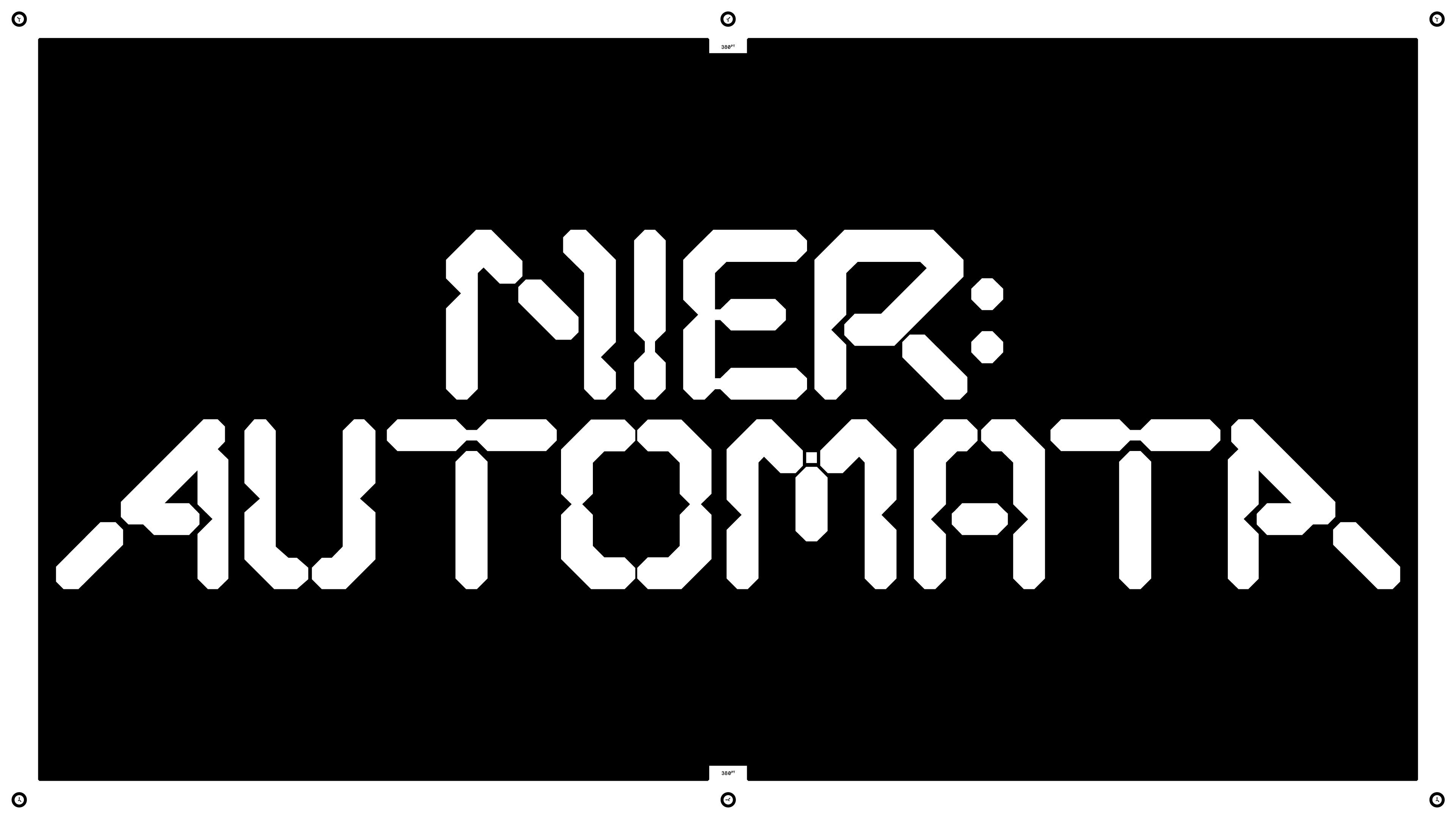
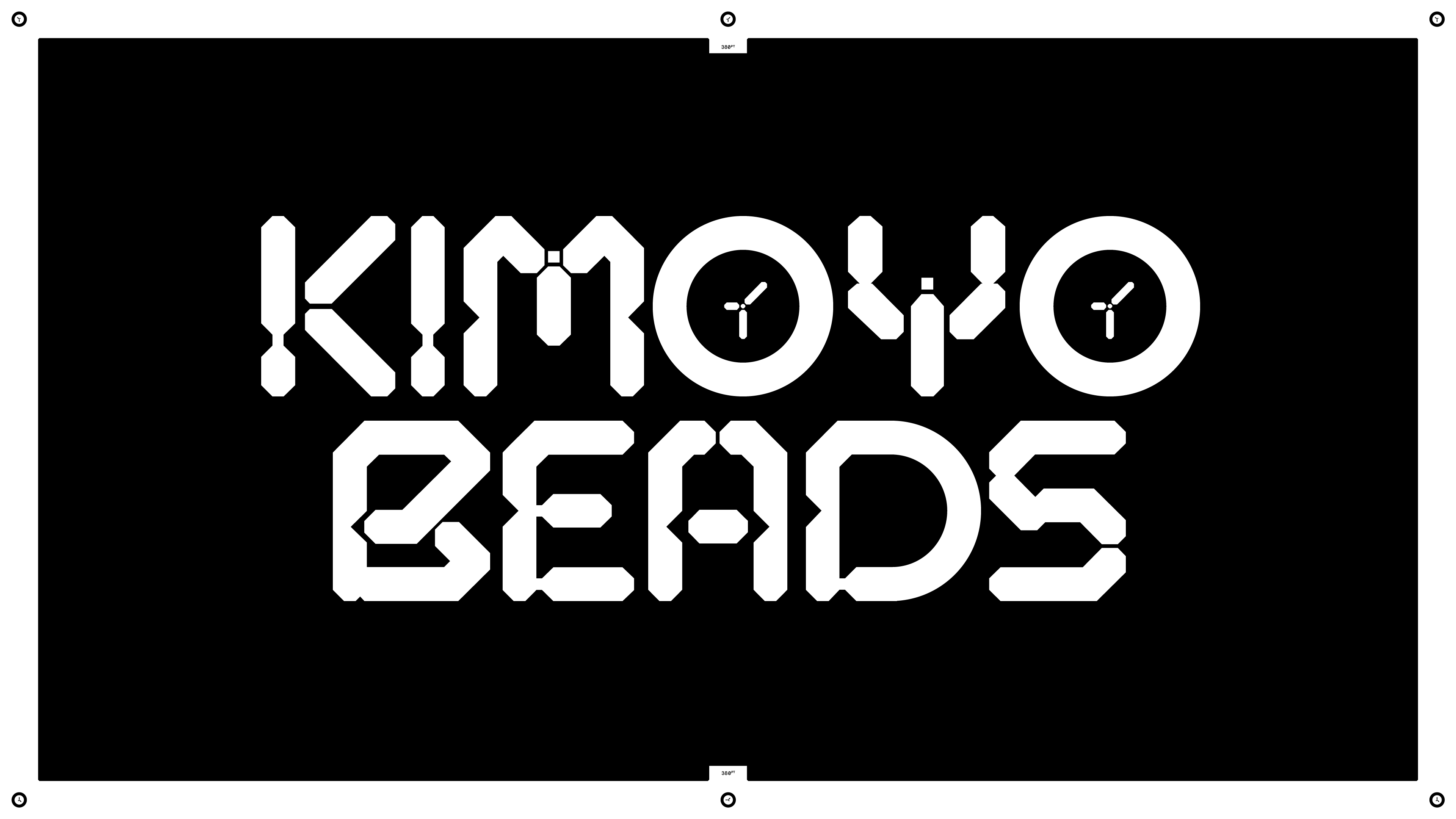
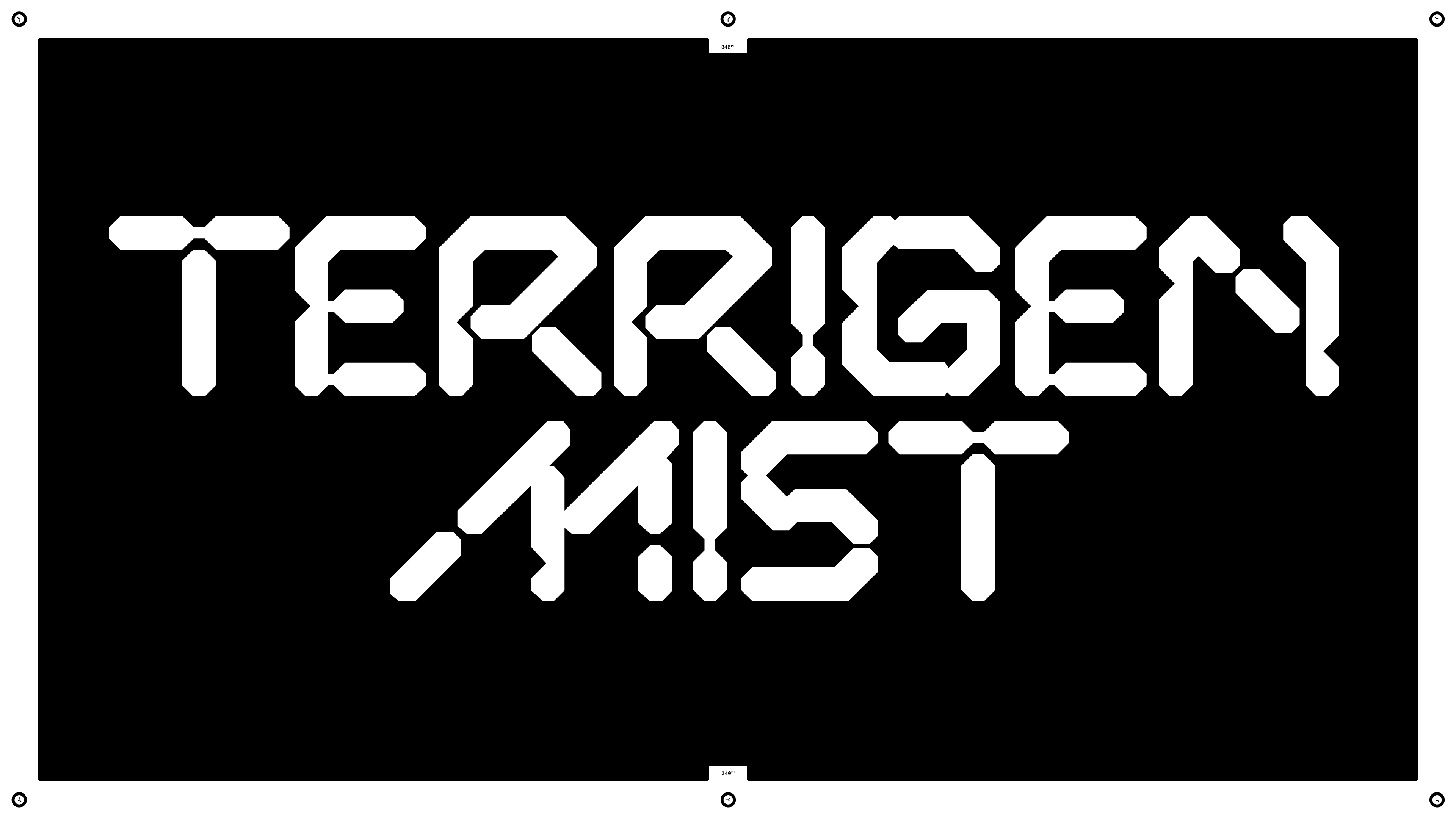
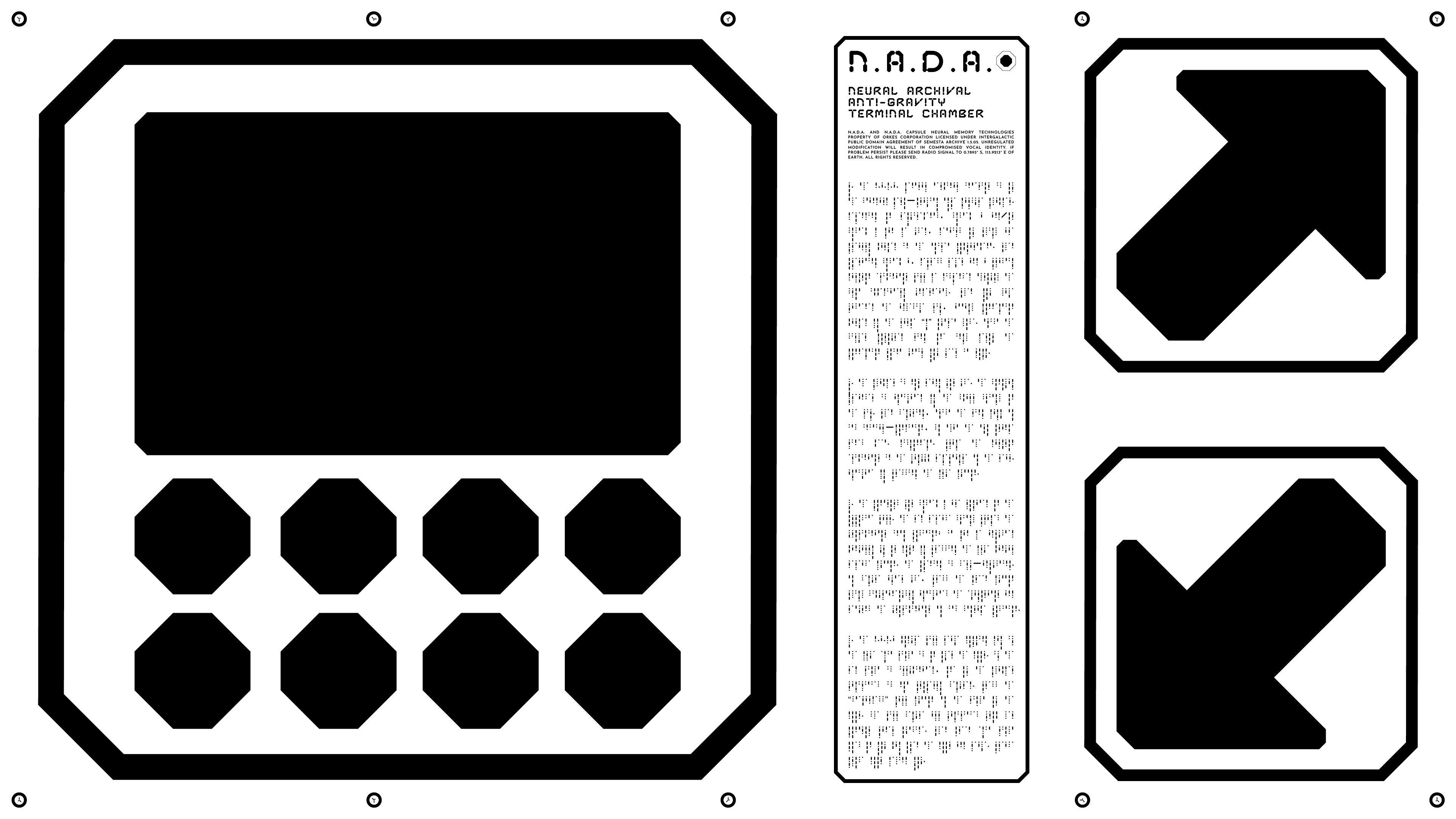
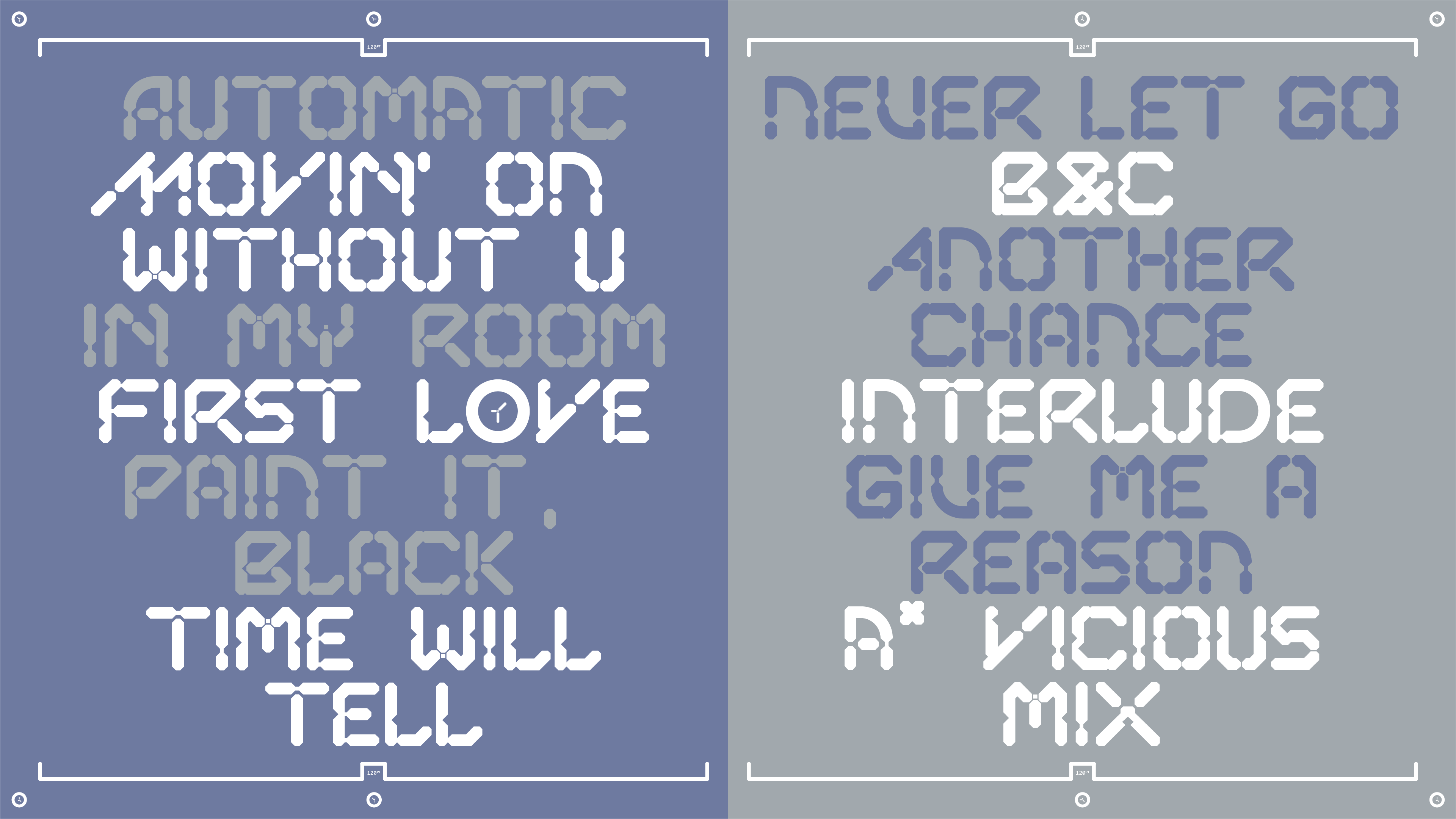
Capsule Display is not a text font in any traditional sense (as the name suggests), so if pure legibility is required, Capsule is probably not the most suitable for formal use. Capsule Display is most effective at display sizes. Due to its very obviously static style Capsule Display demands creative and skilled treatment; while it seems very limiting (more in science-fiction, technology, futuristic themed projects). Letters of this typeface can become and create its own identity throughout each word typed.
The Capsule Display family features three font styles that allow for pin lines between letters at a variety of sizes. It was designed based off the same modules & structural integrity of the Orkes Semesta logotype (original usage). The letters are applicable in most display usages in Regular, Wide & Roman. All of the styles are very heavy and thick, perfect for usage in titling & creating entirely new identities & expressions with the right amount of creative skill.


ENTIRE WORLDS BY MARIO PEGAS IS A CREATIVE & DESIGN PRACTICE THAT FOCUSES ON SOLVING PROBLEMS THROUGH FORMING NARRATIVES & VISUAL STORYTELLING AS CARRIERS OF VOICES. OFFERING NEW EXPERIENCES & LANDSCAPES, THROUGH IDENTITIES, MYTHOLOGIES & EVENTUALLY, ENTIRE WORLDS; AS CREATIVE STRATEGIES TO CARRY LEGACIES & LEAVE A MARK.
CONTACT@MARIOPEGAS.INFO
(+62) x TEBET, JAKARTA
CONTACT@MARIOPEGAS.INFO
(+62) x TEBET, JAKARTA

THE INFORMATION CONTAINED IN THIS SITE IS EXCLUSIVELY PREPARED FOR THE INTENDED READERS. NO PART OF THIS PUBLICATION CAN BE REPRODUCED, STORED IN AN INFORMATION ACCESS SYSTEM, USED IN A SPREADSHEET, OR DISTRIBUTED IN ANY FORMAT OR MEDIA - ELECTRONIC, MECHANICAL, PHOTOCOPY, RECORDING, OR ANY OTHER FORMS - WITHOUT THE WRITTEN PERMISSION & CONSENT FROM MARIO PEGAS & THE MENTIONED PROJECT PARTNERS & PARTIES INVOLVED.
©2024 MARIO PEGAS. ALL RIGHTS RESERVED.
©2024 MARIO PEGAS. ALL RIGHTS RESERVED.