


SINAU INDONESIA
Type of Work
Branding & Identity, Social Media
Type of Client
Fashion
Branding & Identity, Social Media
Type of Client
Fashion
Role
Art Director, Lead Graphic Designer, Photographer
Team – Collaborators
* IMG- Maika Collective Studio (Agency)
John Carlo, Phelia Amadea, Shannon Joycelyn
Art Director, Lead Graphic Designer, Photographer
Team – Collaborators
* IMG- Maika Collective Studio (Agency)
John Carlo, Phelia Amadea, Shannon Joycelyn
Project Status
Completed
Project Length - Year
3 Months - 2021
Completed
Project Length - Year
3 Months - 2021

SKETCH OF THE ORIGINAL SINAU LOGOGRAM
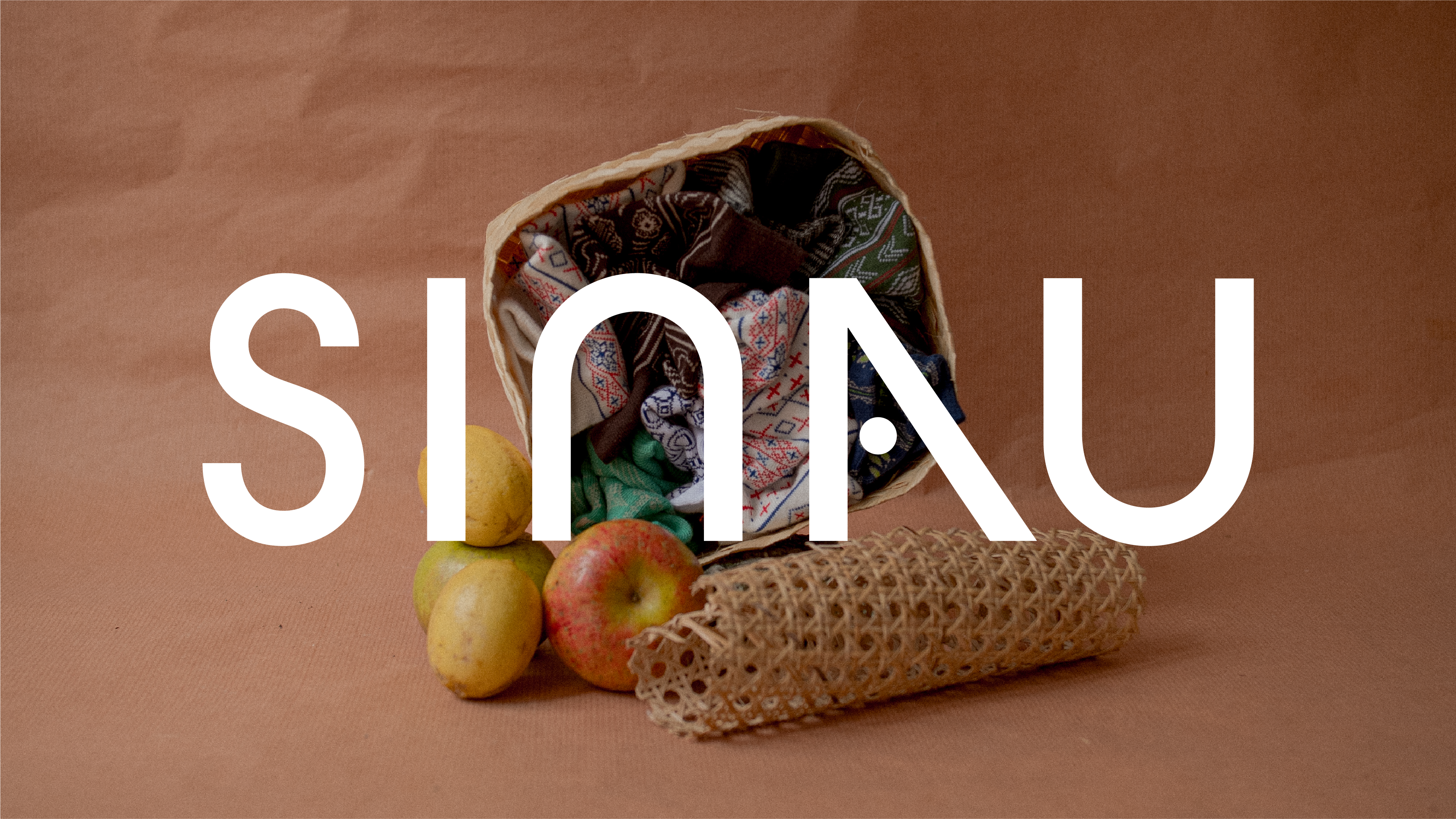
In the last 5 years, Sinau has build a gallery full of heritage crystalised in artisan socks. From the past experience and study cases, we can learn our heritage is not just to be scoured from the surface but to be thoroughly learned from the source. Sinau, as a brand who brought up the word “learn” as a standing value, needs to portray the learning process so that customers will be encouraged to do so too. Consistently, bringing our hidden heritage to light little by little, unveiling it to the world, giving a sense of pride to its people. The conception of Sinau from it’s early days until its legibility as a business was always a labour of learning — one of our earliest inspirations for the designs of our socks was the ethnic patterns originated from Indonesia — to stamp our identity as a local brand & putting our heritage at the forefront as a token of appreciation & cultivation of local & homegrown culture.
The origin of the brand & its selection of socks as the primary product based on the idea that socks are mundane & everyday accessory easily overlooked. The name ‘Sinau’ is inspired by a very personal experience — our founder’s own experience with his grandmother — the experience of being told to ‘go study’ — ‘sinau le’ in Javanese. Etymology - the word ‘Sinau’ means ’learn’ or ‘to learn’ in Javanese — it inspired the state of learning, willingness to learn — with the heritage of Indonesia as something to pursue and uncover.
We dwelved into these stories of old of how the brand came to be, and reiterate the narrative into the new identities.


MANIFESTOS
A REFRESHED IDENTITY
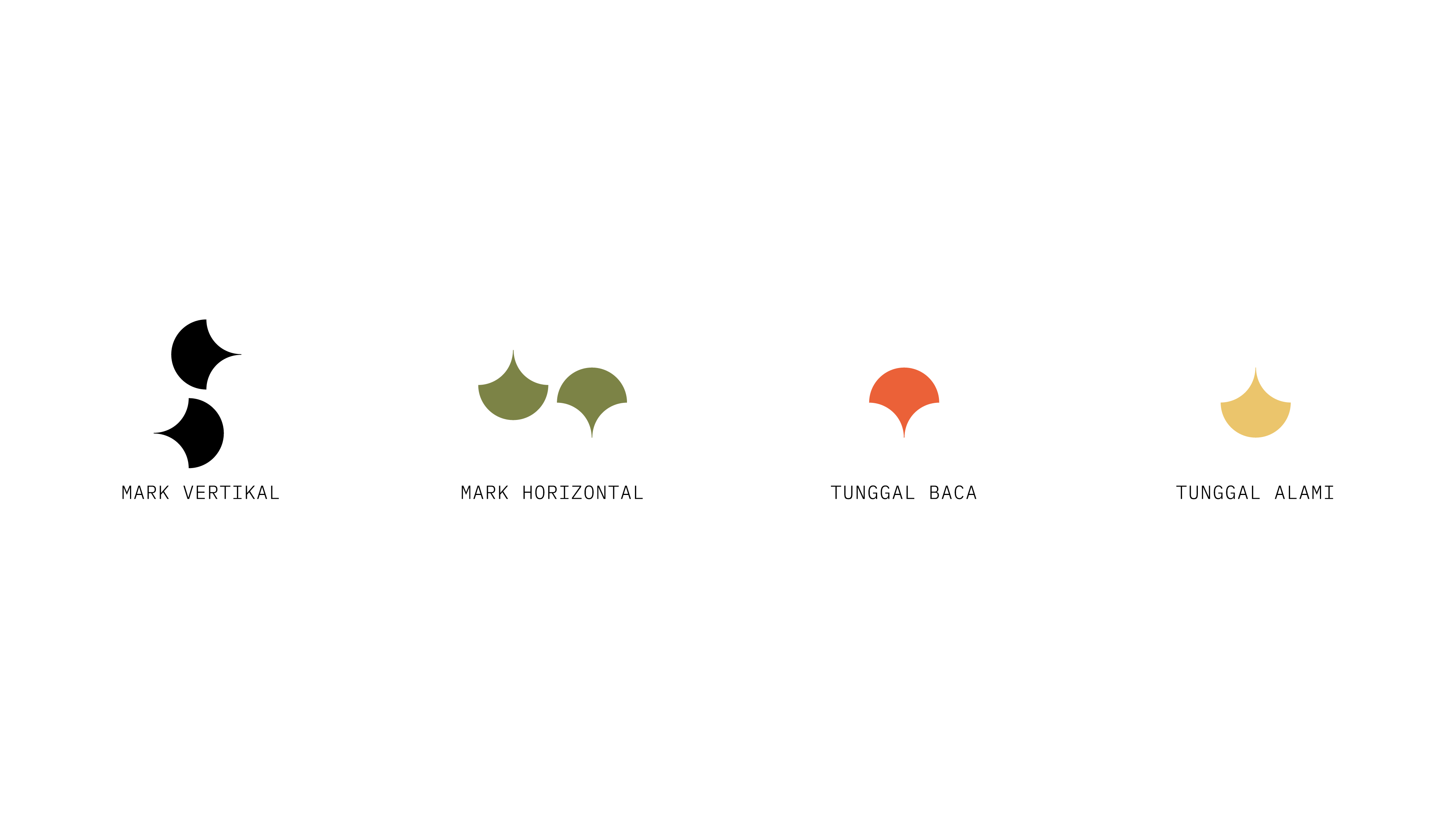
Sinau Indonesia as a local brand must have a way of communicating its visual identity — to a an existing & potential audience as a new entity. The logomark is the main identity of the brand to communicate the ideas & personality of the brand. It’s the identity that’s kept intact. The hierarchy of the branding architecture as per the diagram on the side; a concise & clear branding system that communicates the responding identites eloquently with visual consistency.
The new logo depiction still follows the same principles & forms - as Sinau has brought up so far - but the implementation has a clear system and is designed according to Sinau's new direction. The new brand architecture is initiated by logomark & logotype as the main entity - the main entity is the main mode of communication from Sinau followed by the second which is a variation of the application of existing logos.
The new logo depiction still follows the same principles & forms - as Sinau has brought up so far - but the implementation has a clear system and is designed according to Sinau's new direction. The new brand architecture is initiated by logomark & logotype as the main entity - the main entity is the main mode of communication from Sinau followed by the second which is a variation of the application of existing logos.

VISUAL IDENTITY

VISUAL IDENTITY IMPLEMENTATIONS


OTHER IMPLEMENTATIONS
TONES & COLORS
The colors of Sinau are inspired by a myriad of sources. But first and foremost,The tonality of the colors are inspired by nature, the process of learning, and The wonder that evoked when one experiencing the array of cultures of Indonesia. Overall, the tone of the colors are leaning towards warmer, more pastel colors. It's mostly derived from how the naked eye perceived things around us, which is more raw, candid and non-artificial. Therefore the colors should reflect the world where sinau resides. A natural-oriented sinau — with subtle, easy and modest colors.
Some of the selected colors inspired by the natural tonality of the Archipelago. The naming of the colors are inspired by mundane objects found in the subcultures of Indonesia. These colors are not mandatory and the only colors to use. But the ones that reflect the new direction Sinau is taking. These colors are used to reflect the new brand direction — maintained in the many visual collaterals Sinau will produce. It should not limit the exploration of the products, keep things separate between the two to create distinction and consistency.
Some of the selected colors inspired by the natural tonality of the Archipelago. The naming of the colors are inspired by mundane objects found in the subcultures of Indonesia. These colors are not mandatory and the only colors to use. But the ones that reflect the new direction Sinau is taking. These colors are used to reflect the new brand direction — maintained in the many visual collaterals Sinau will produce. It should not limit the exploration of the products, keep things separate between the two to create distinction and consistency.

THE COLORS OF SINAU INDONESIA
AN INDONESIAN TONALITY
A brand needs an identification that is more than just a change of expressed expression; but also implied — in this section will be described how the 'taste' of the new Sinau can be communicated through the media of photography, writing, & visual identity of the product. Visually — Sinau would like to communicate a visual atmosphere that represents the authentic Indon — a tonality that is warm & friendly and full of nostalgia but don't look old and still fresh.
Sinau want to position itsself as a contemporary brand that can become a media for storying about raw & original Indonesian culture — which embraces the nature & interest of indonesian audiences to explore cultural heritage.
Sinau want to position itsself as a contemporary brand that can become a media for storying about raw & original Indonesian culture — which embraces the nature & interest of indonesian audiences to explore cultural heritage.

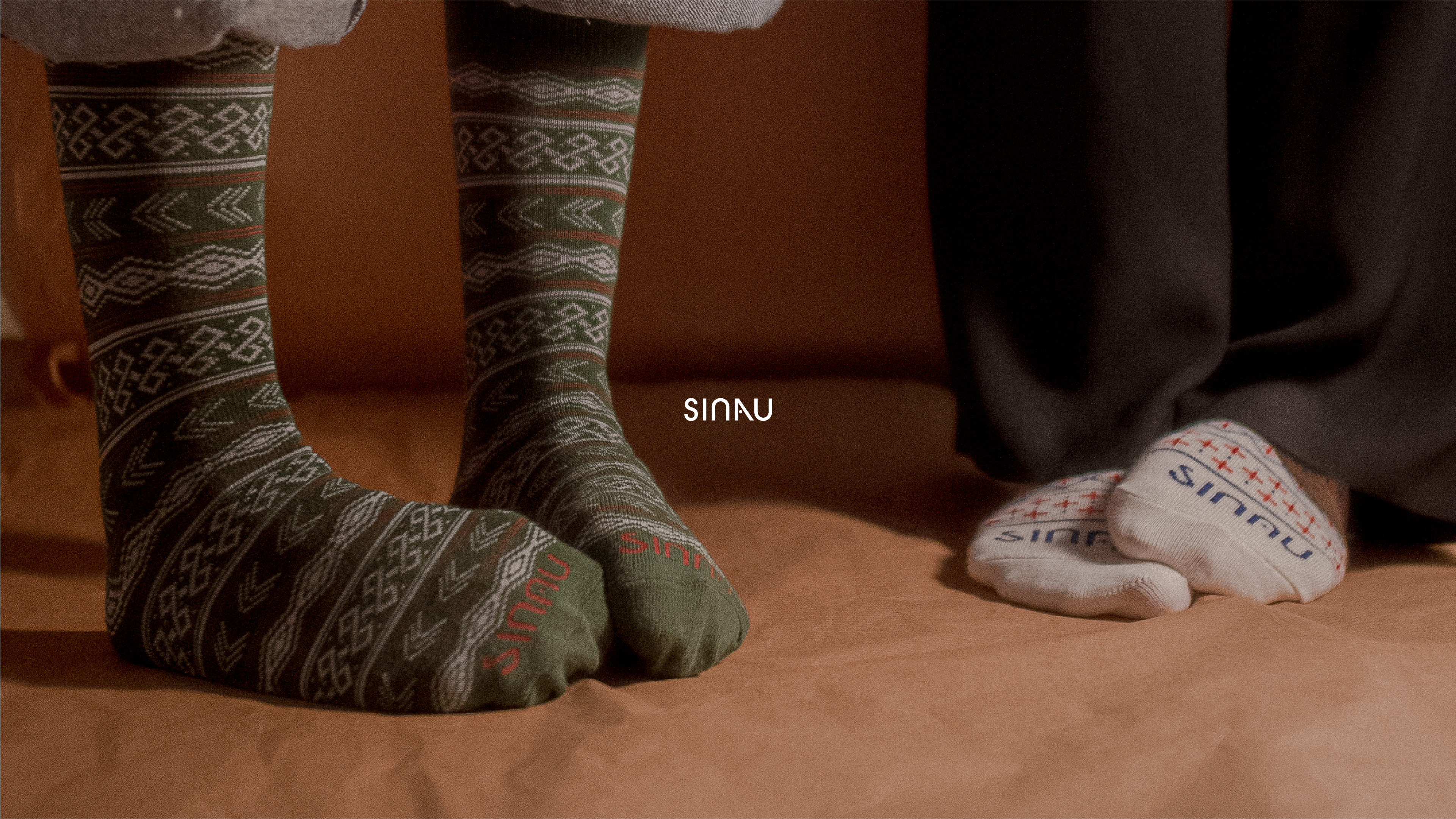
ART DIRECTION & PHOTOGRAPHY
In interpreting Sinau's branding values the photography needed to reflect the core values of the brand visually. The resulting photos must be able to display the principles of learning (learning); wonder (ketakjuban); & natural (nature). The formation of abstract values is displayed in the photography category used to communicate Sinau's products.


EDITORIALS
Photo editorials are used to portray narrative with human touch — how does the articles and its story interact in sets & poses of the users. It gives perspectives on how sinau’s products can embody a lot of things. We want to create the sense that Sinau is embedded naturally — natural can mean a lot of things and we mean that both literally and figuratively. Always be curious and always redirect the feel to its most natural state. Create a serene natural atmosphere that encourages wonder and learning.

CORRESPONDING ARTWORKS

STATIONERIES

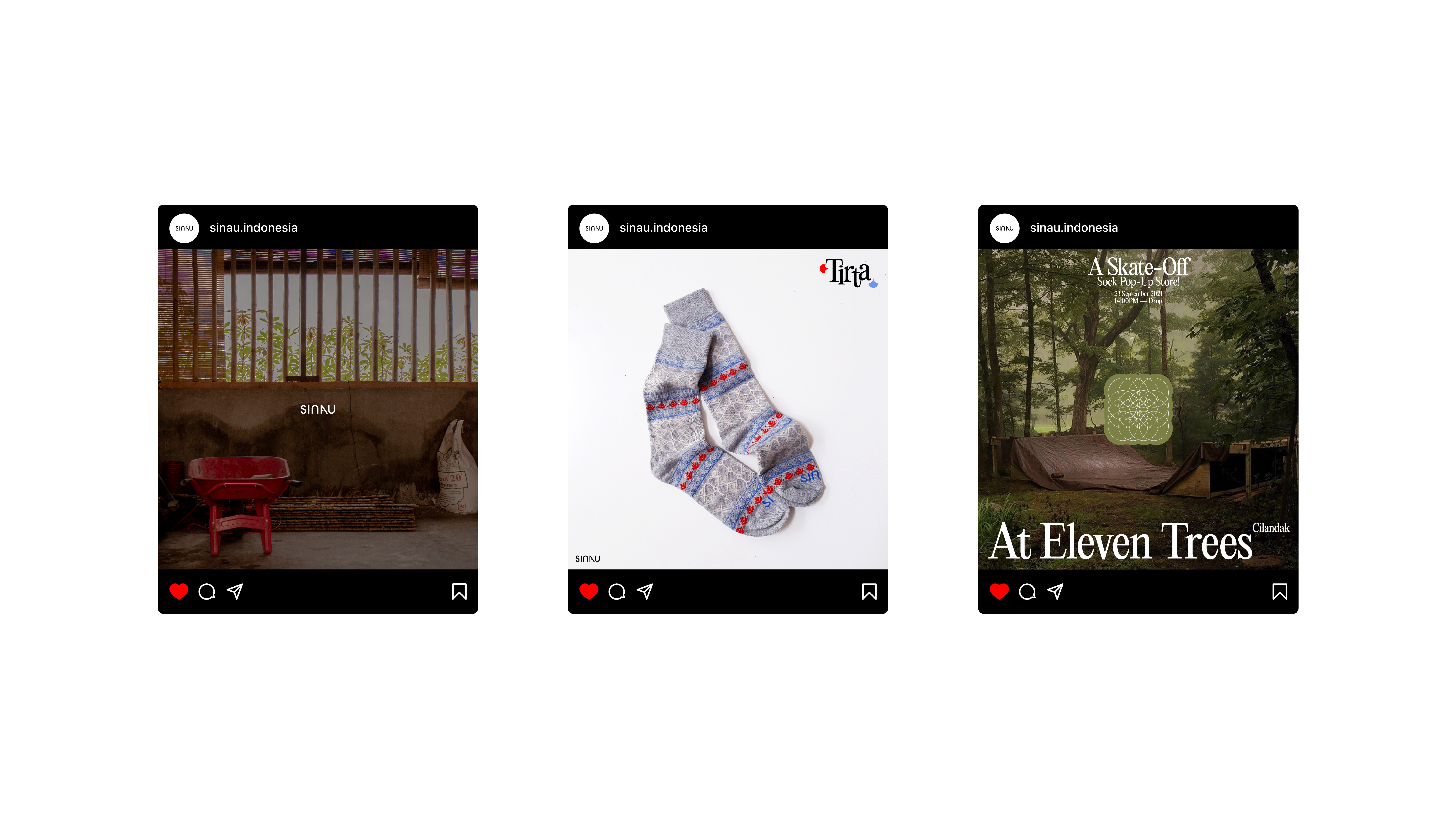

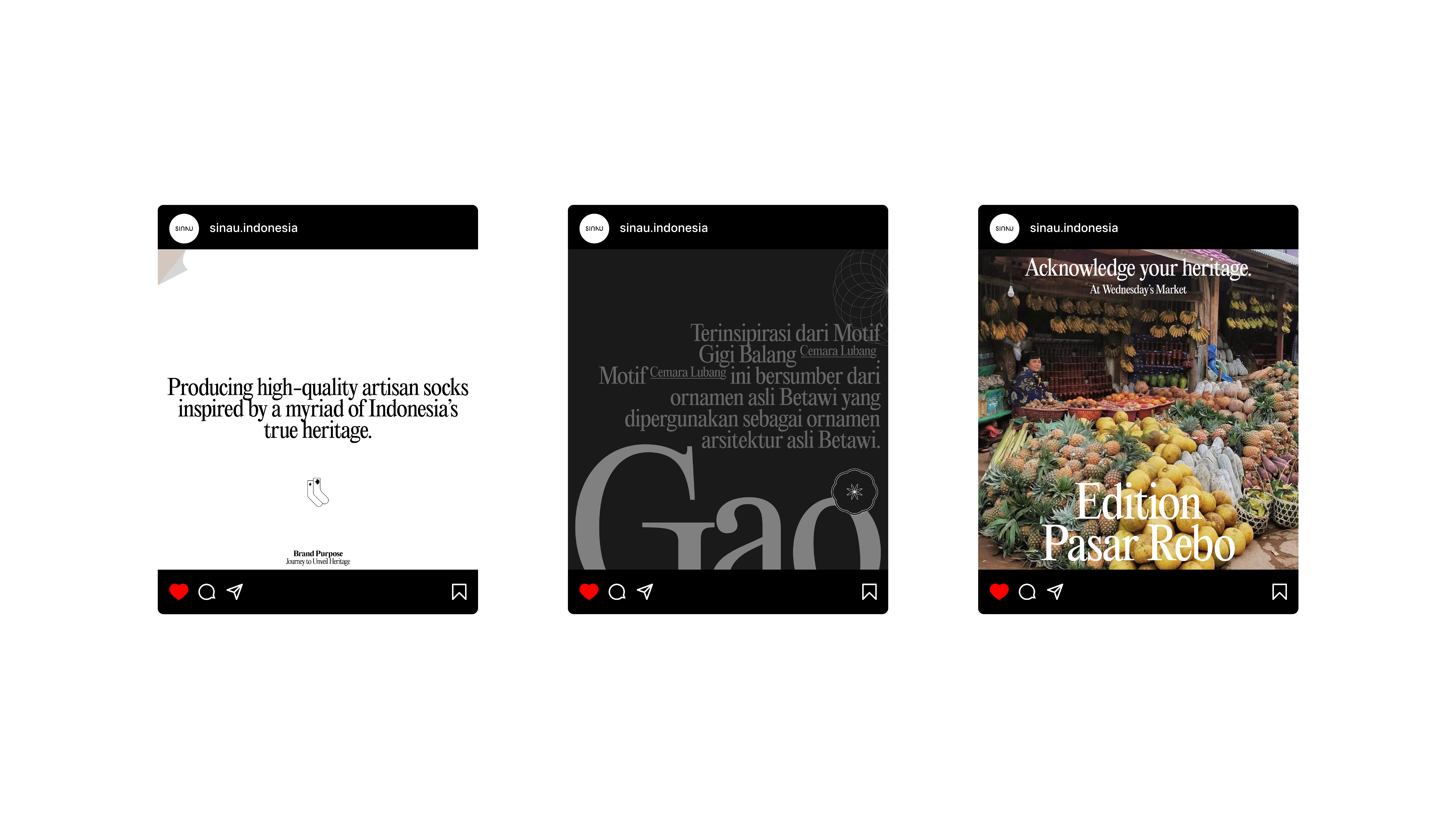
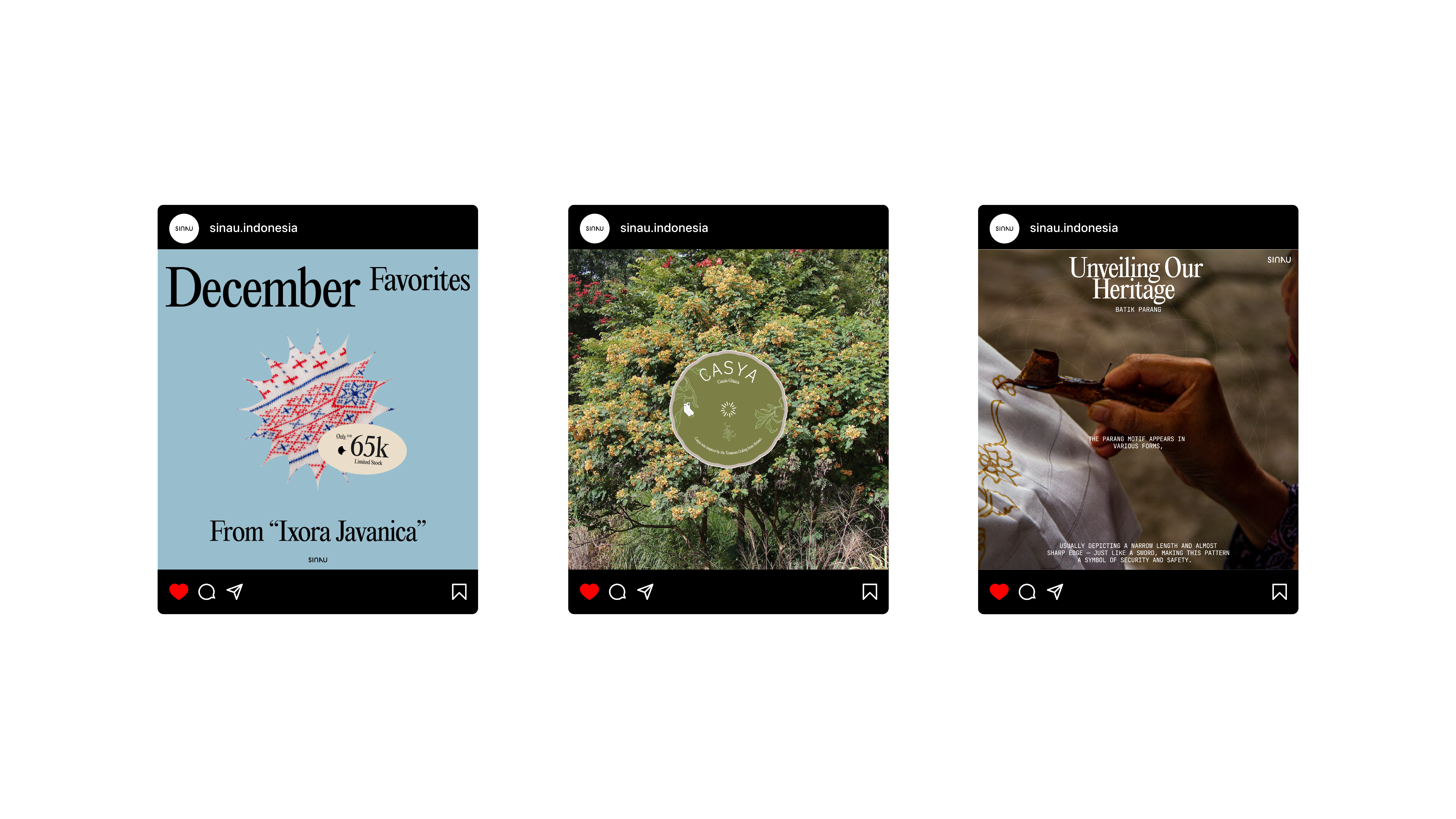
SOCIAL MEDIA
ENTIRE WORLDS BY MARIO PEGAS IS A CREATIVE & DESIGN PRACTICE THAT FOCUSES ON SOLVING PROBLEMS THROUGH FORMING NARRATIVES & VISUAL STORYTELLING AS CARRIERS OF VOICES. OFFERING NEW EXPERIENCES & LANDSCAPES, THROUGH IDENTITIES, MYTHOLOGIES & EVENTUALLY, ENTIRE WORLDS; AS CREATIVE STRATEGIES TO CARRY LEGACIES & LEAVE A MARK.
CONTACT@MARIOPEGAS.INFO
(+62) x TEBET, JAKARTA
CONTACT@MARIOPEGAS.INFO
(+62) x TEBET, JAKARTA

THE INFORMATION CONTAINED IN THIS SITE IS EXCLUSIVELY PREPARED FOR THE INTENDED READERS. NO PART OF THIS PUBLICATION CAN BE REPRODUCED, STORED IN AN INFORMATION ACCESS SYSTEM, USED IN A SPREADSHEET, OR DISTRIBUTED IN ANY FORMAT OR MEDIA - ELECTRONIC, MECHANICAL, PHOTOCOPY, RECORDING, OR ANY OTHER FORMS - WITHOUT THE WRITTEN PERMISSION & CONSENT FROM MARIO PEGAS & THE MENTIONED PROJECT PARTNERS & PARTIES INVOLVED.
©2024 MARIO PEGAS. ALL RIGHTS RESERVED.
©2024 MARIO PEGAS. ALL RIGHTS RESERVED.